A New Beginning - Imsety 2022 Rebrand
Background
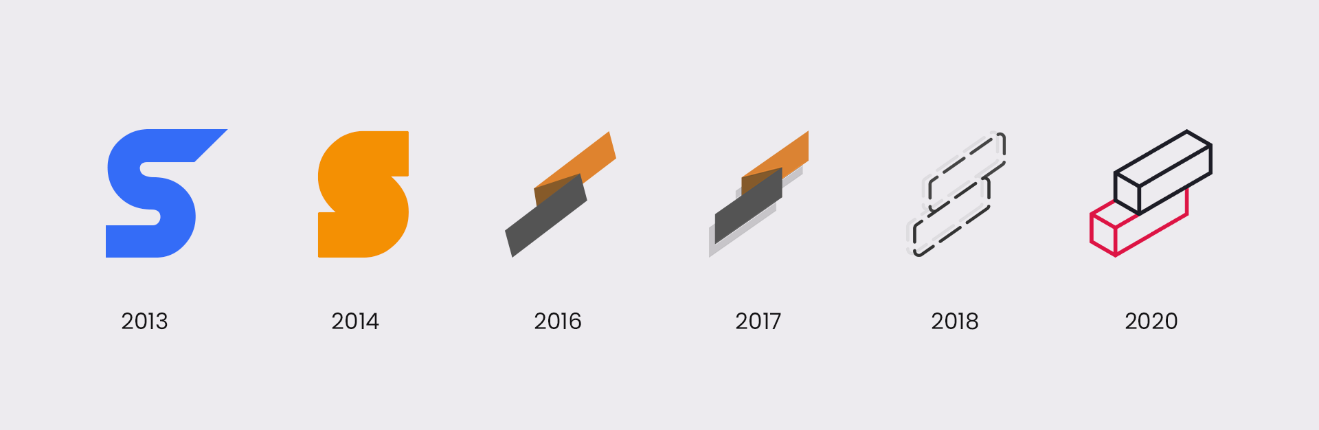
For the past ten years, I've used the name "SetyMedia" as my online identity for design, animation, coding, and everything in between. While the name was initially meant to be for a company, I instead used it as creative alias for everything I did.
But recently, I've wanted to pursue new and exciting ventures. This made me feel like I was outgrowing using this name as my personal identity, as I've been going by this name since I was nine years old.
After much thought, I've decided to rebrand under my real name, "Imsety" (pronounced em-set-tee). I feel like this name better reflects who I am and allow versatility for independent projects I want to do in the future. However, SetyMedia still will find a second life as my professional studio.
I wanted the piece to represent this personal conversion while also paying tribute to the past identities I've had over the years. So in June of 2021, I got to work.
Conception
My approach to this piece was to create something that illustrates a "rebirth from the ashes" with my previous identity transforming into a new one. I decided to separate this piece into three acts accompanied by three follow-up videos, each representing a different stage of the transformation.
In the process of formulating ideas for this project, I was inspired by the works of Sekani Solomon, You Zhang, Oddfellows, and "Circle" by Japanese motion designer レオル.
Music
I find that sound is an essential part of any animation. The music was the first thing I started thinking about when conceptualizing this project.
For this piece, I wanted to create orignal sound design rather than utlizing existing music and sound effects. Every sound you hear in this project has been created or remixed by me.
For "A New Beginning," I wanted the mood of the song to be exciting yet dreamy. I hopped on Ableton Live, and after much experimentation, I came up with a beat that samples Aquarium by NOSAJ THING.
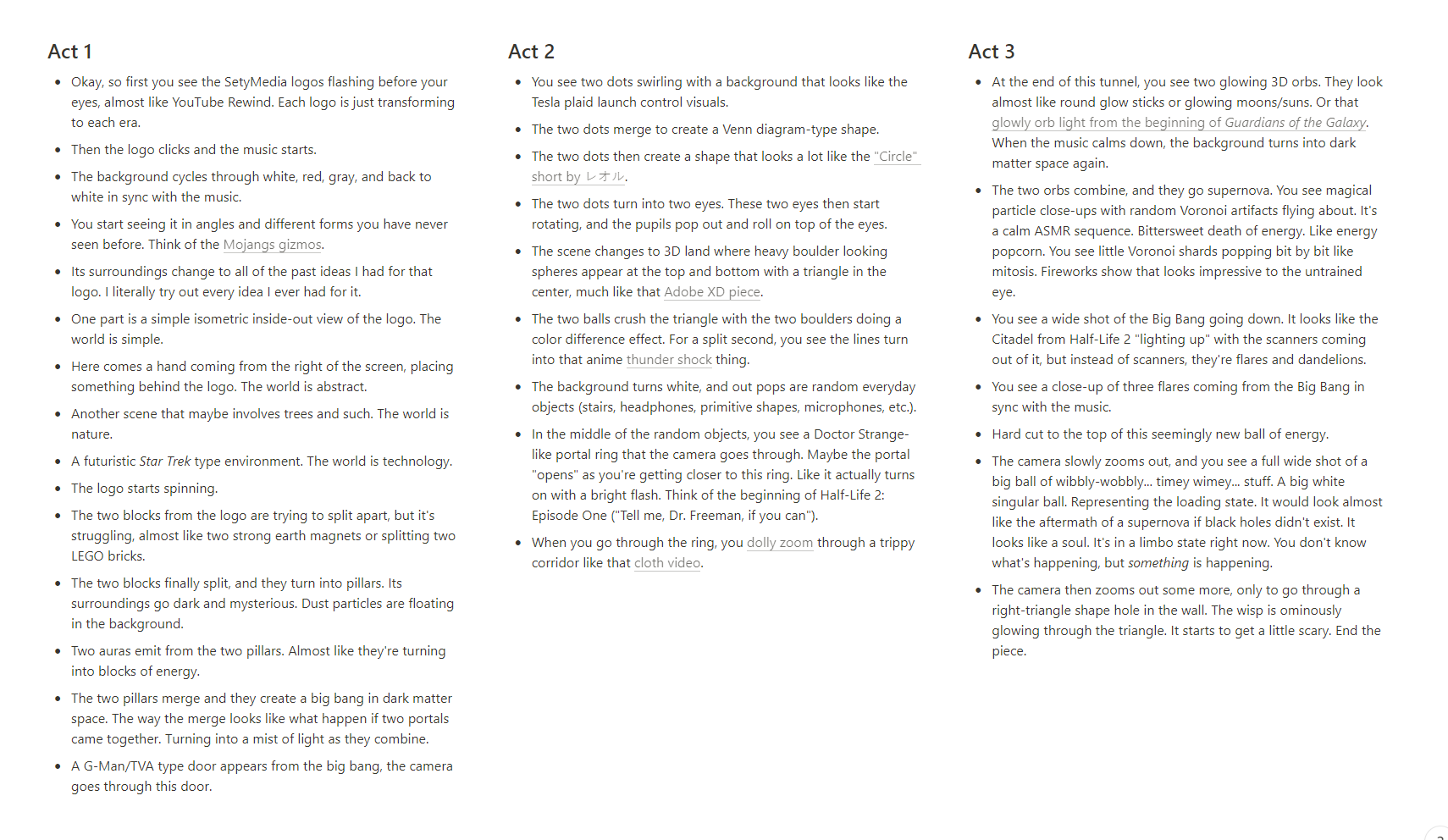
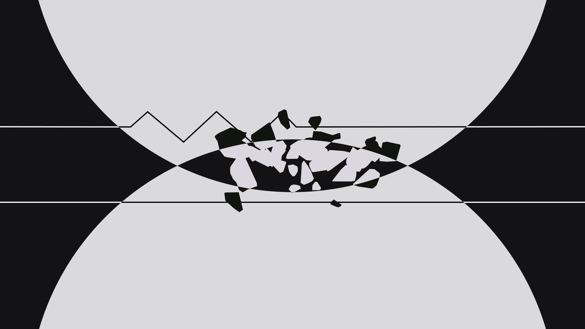
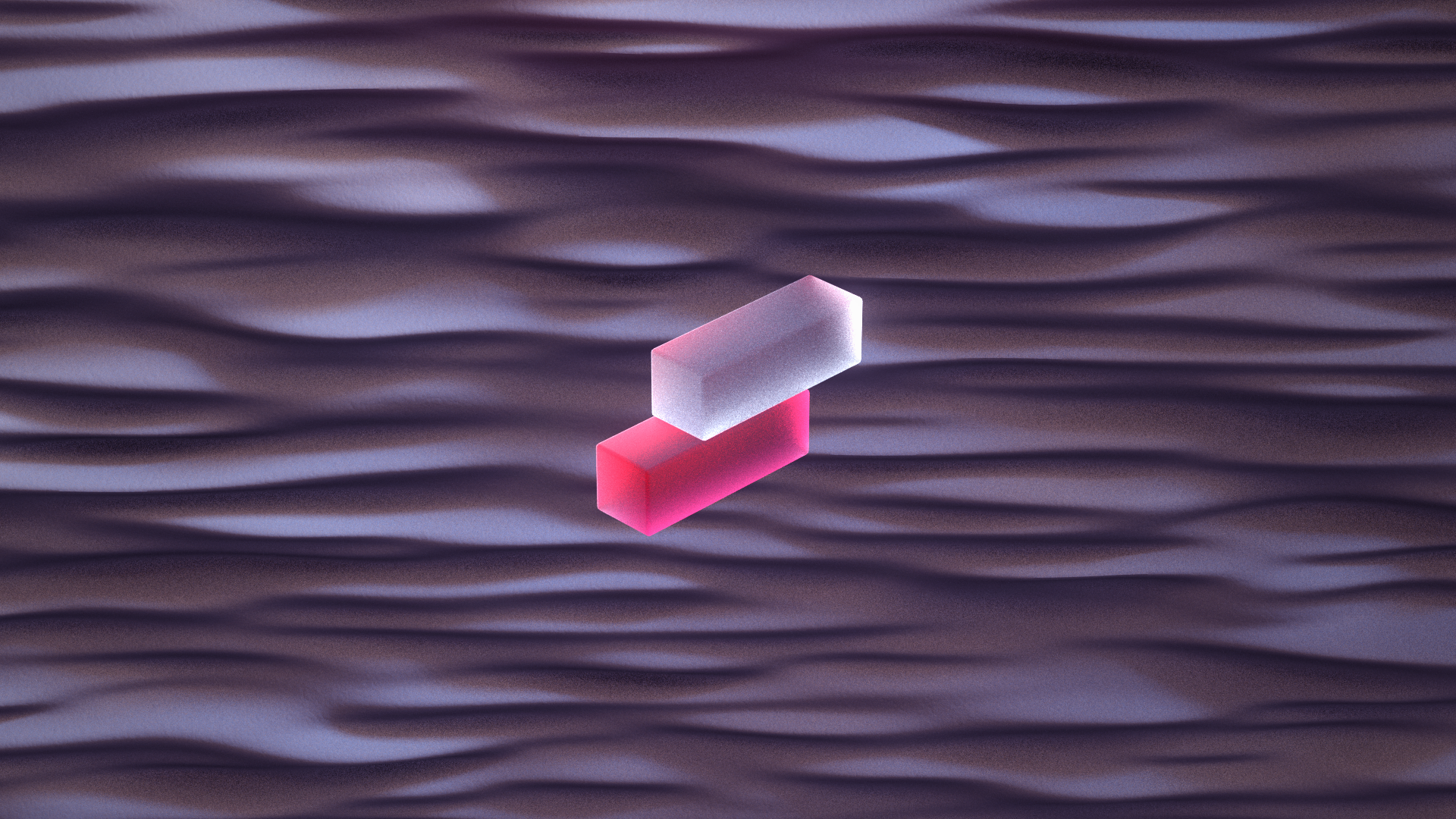
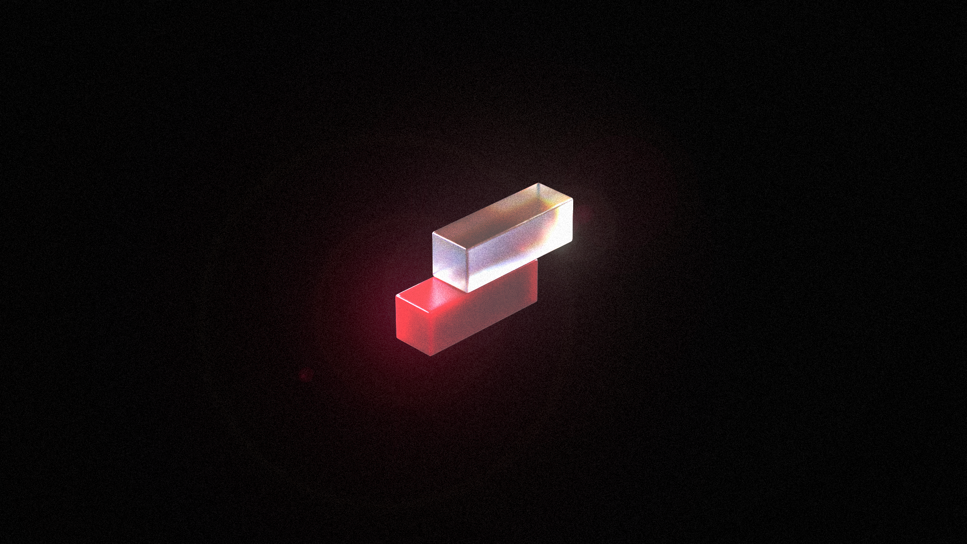
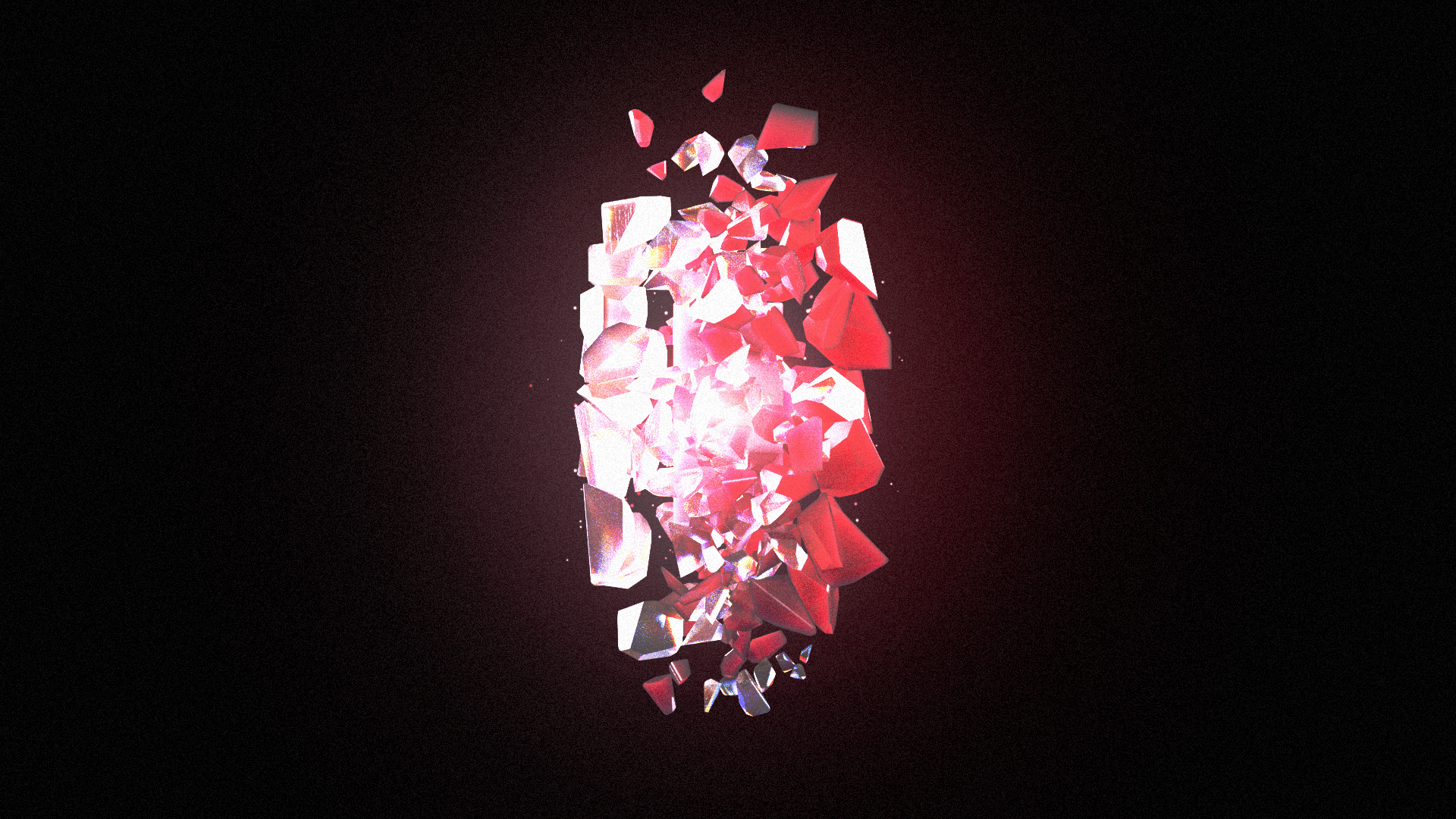
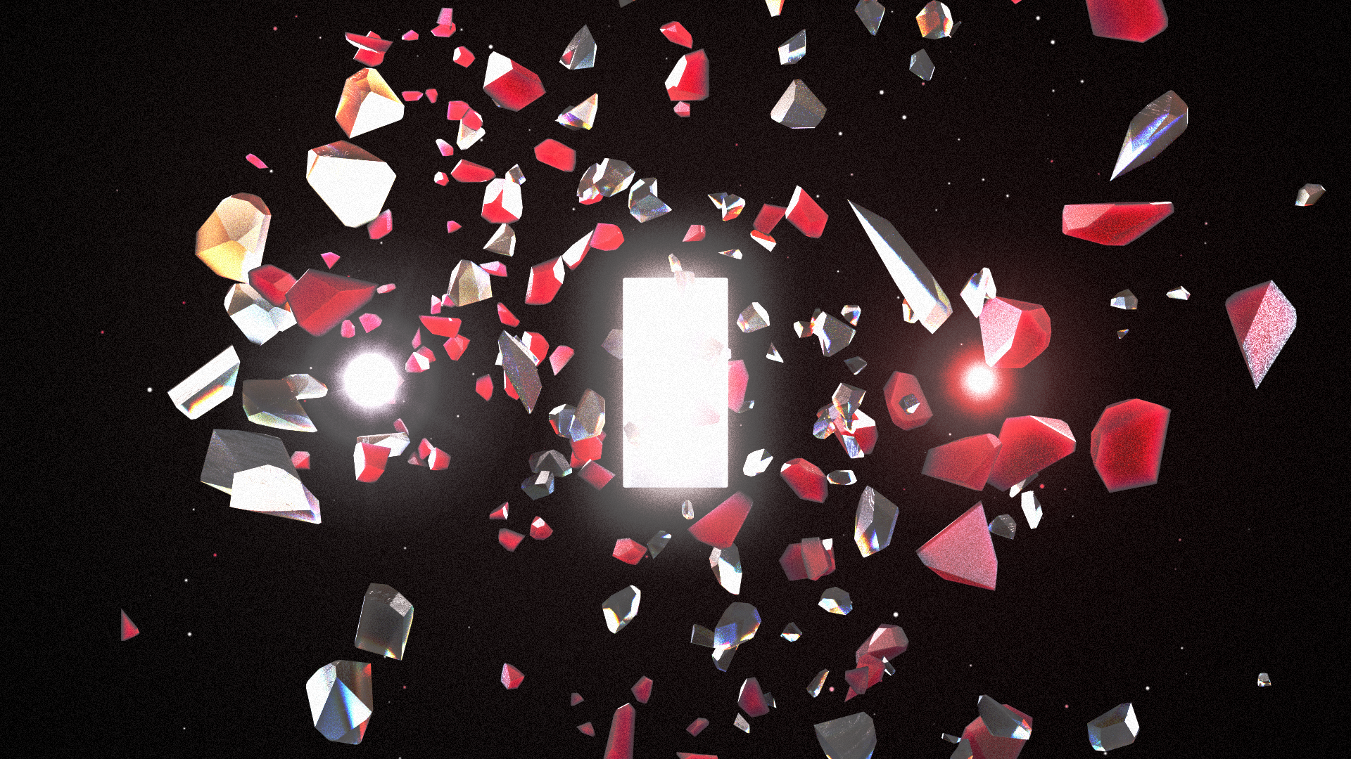
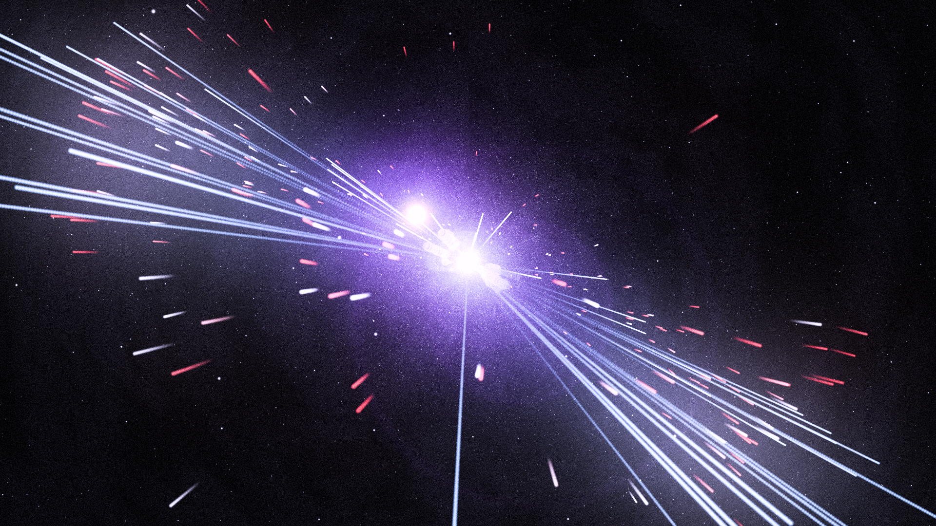
Act 1
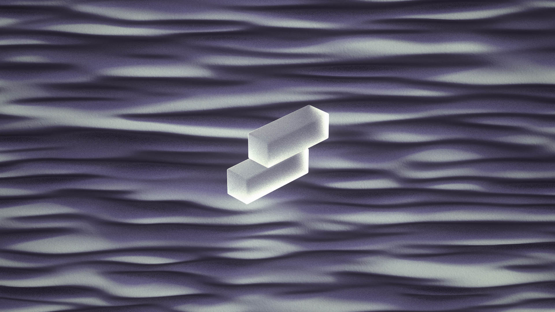
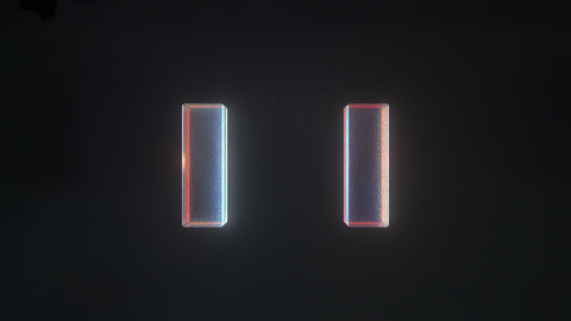
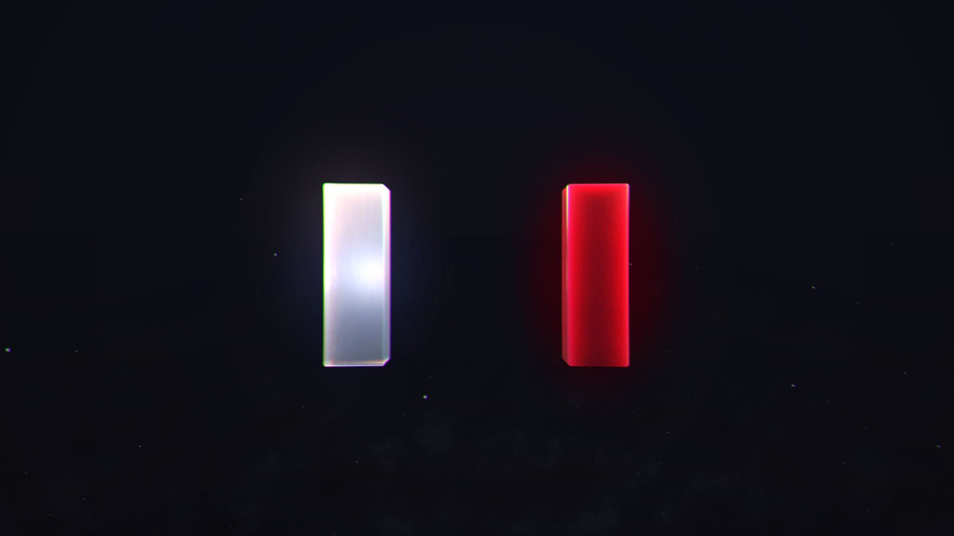
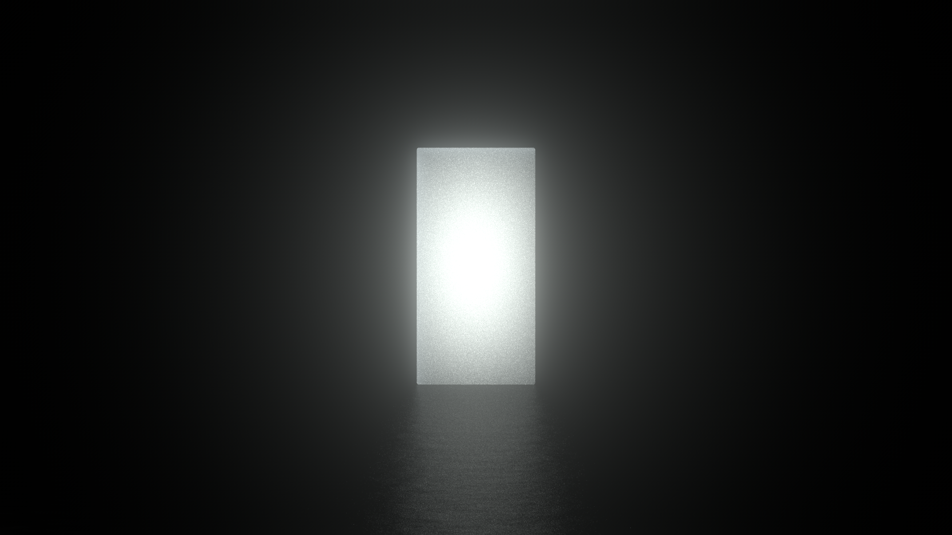
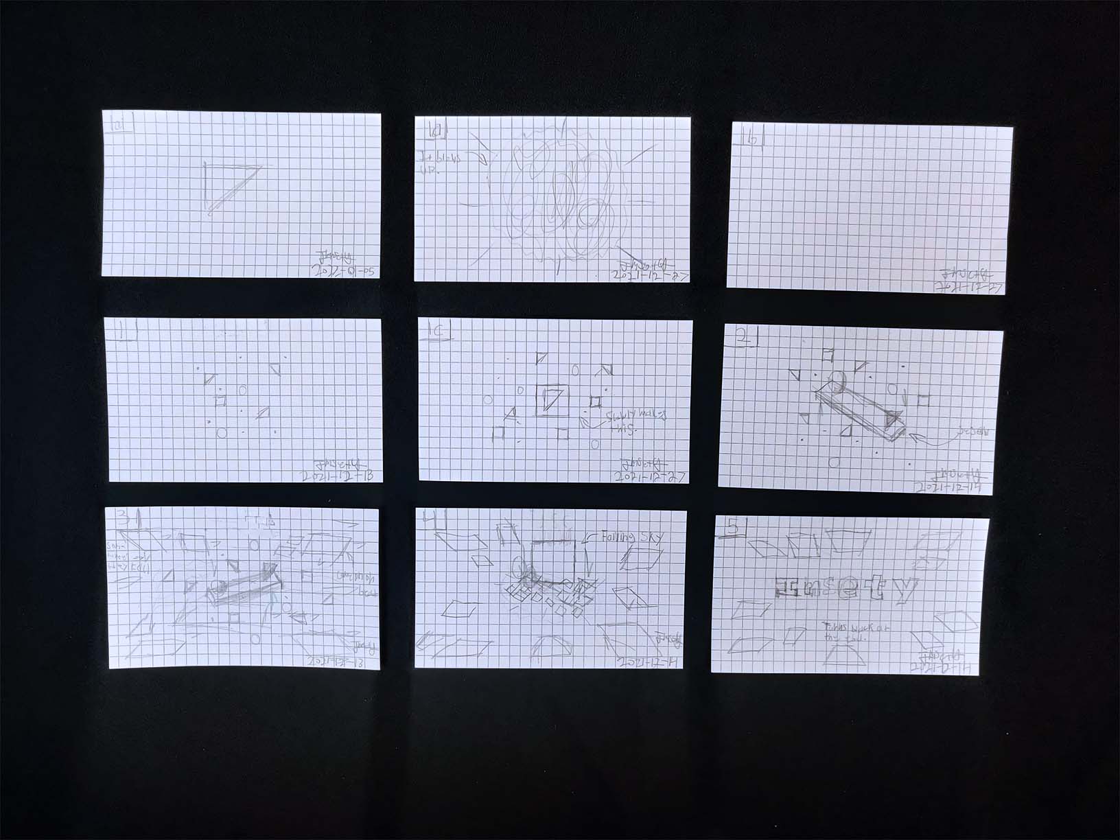
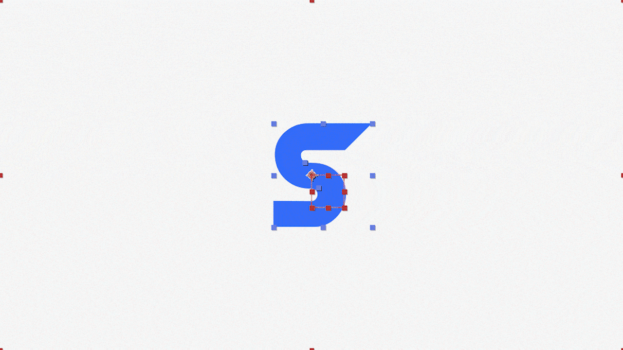
For Act 1, I wanted to have it all be about turning something familiar (my previous logo) and having it transform into something new. Starting with a quick flash of the logos I've used throughout the years, to seeing the present-day logo taking different forms and art styles, to finally disassembling and colliding into something that represents the doorway to pure creativity.
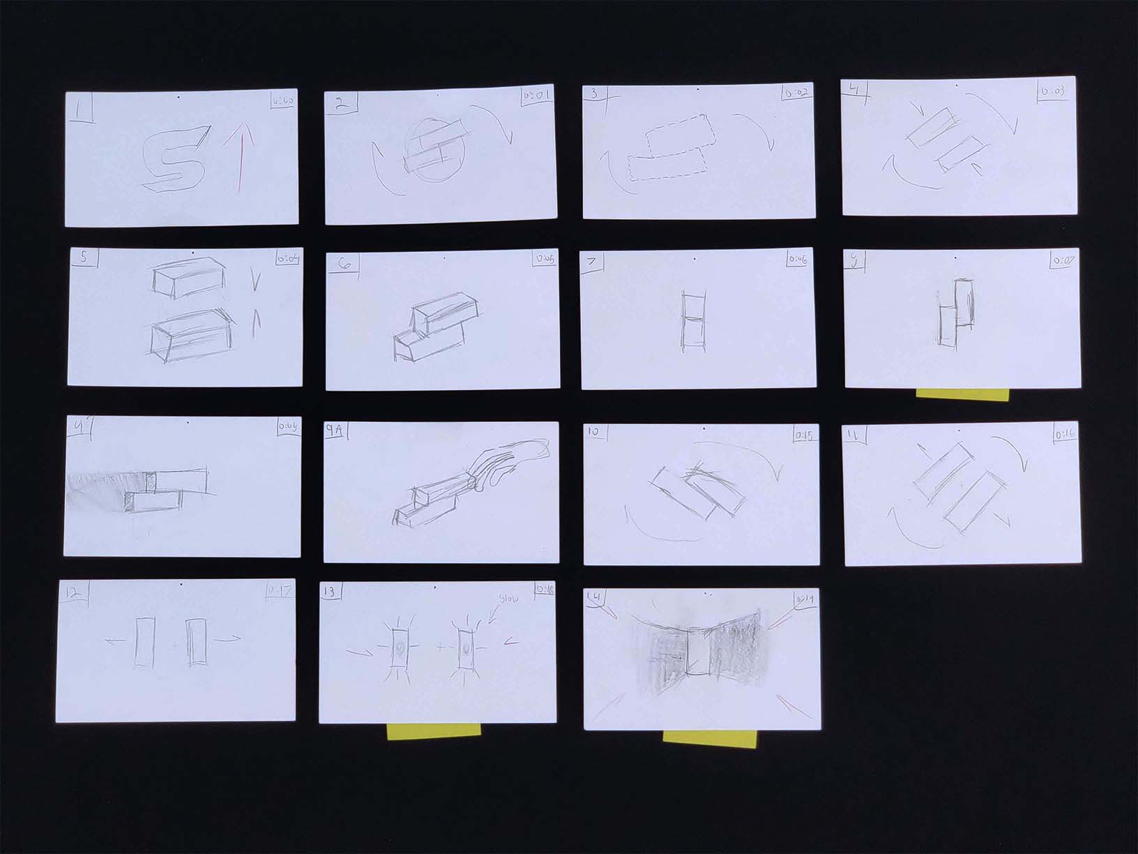
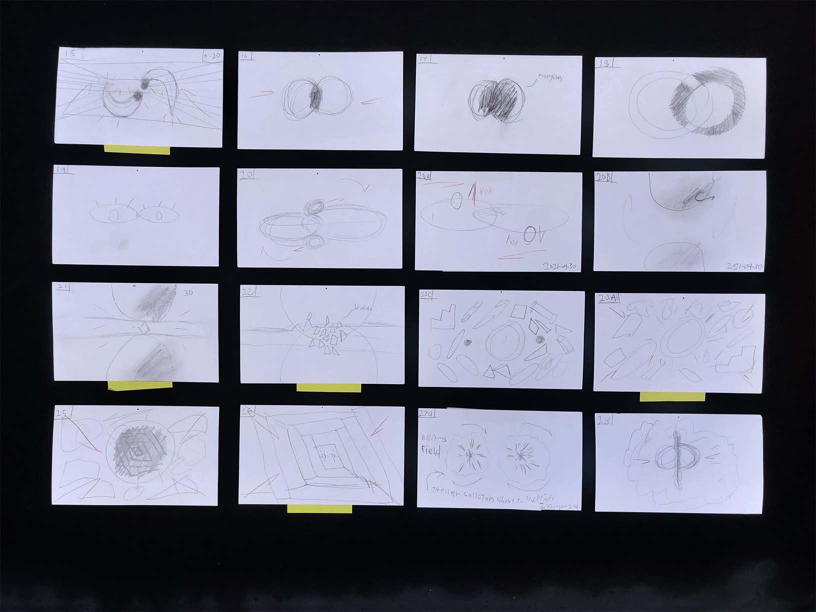
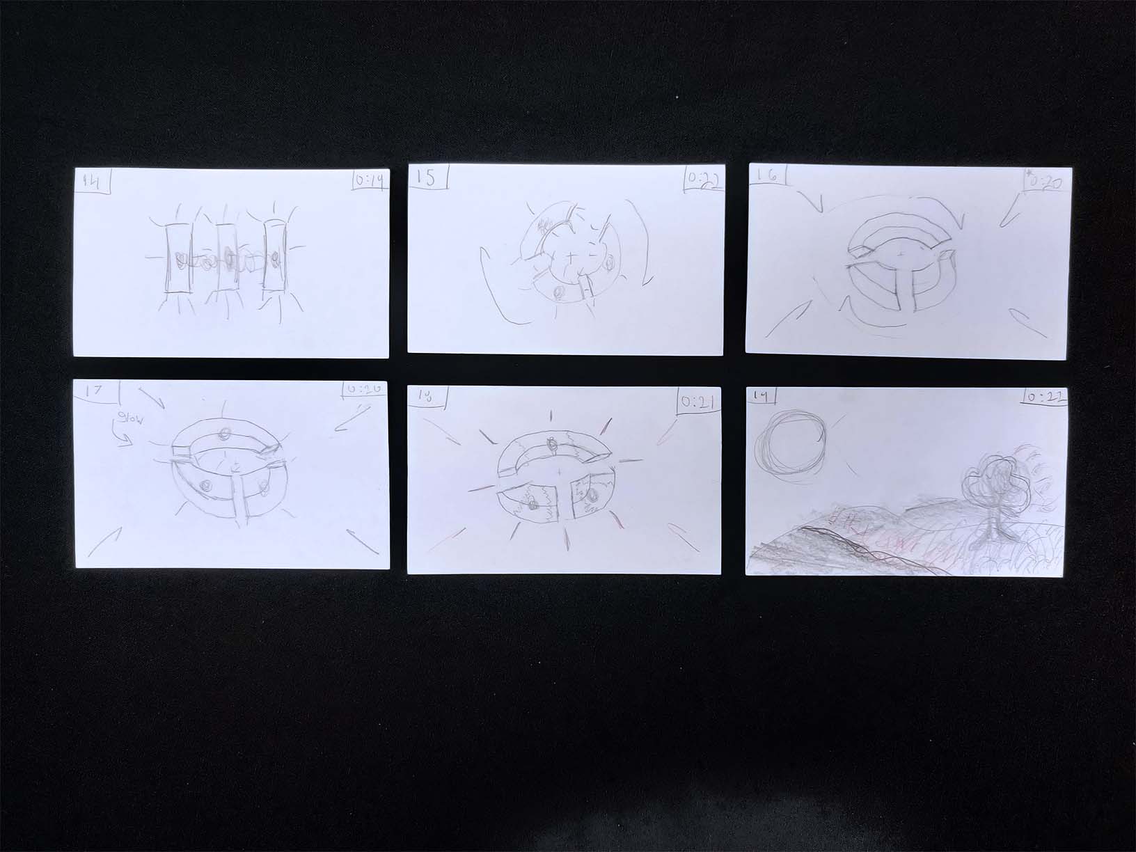
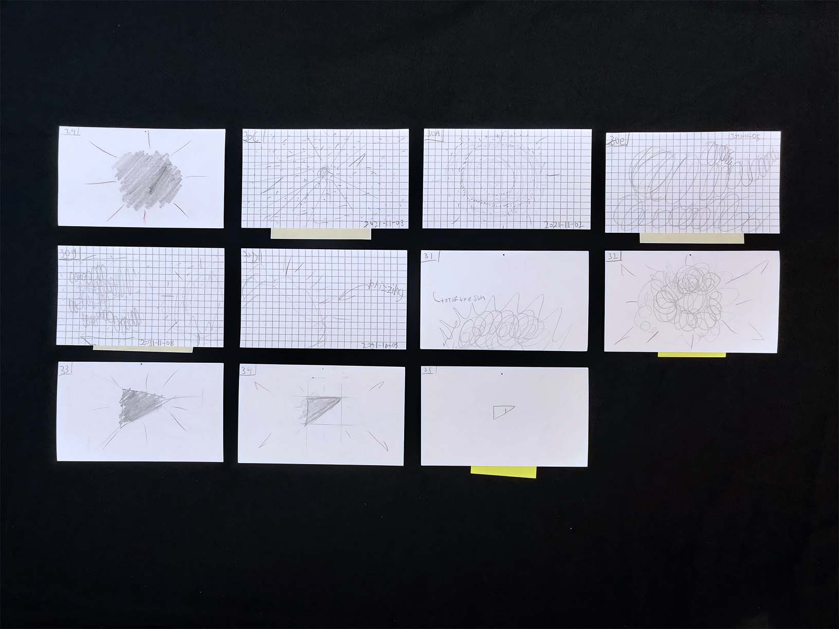
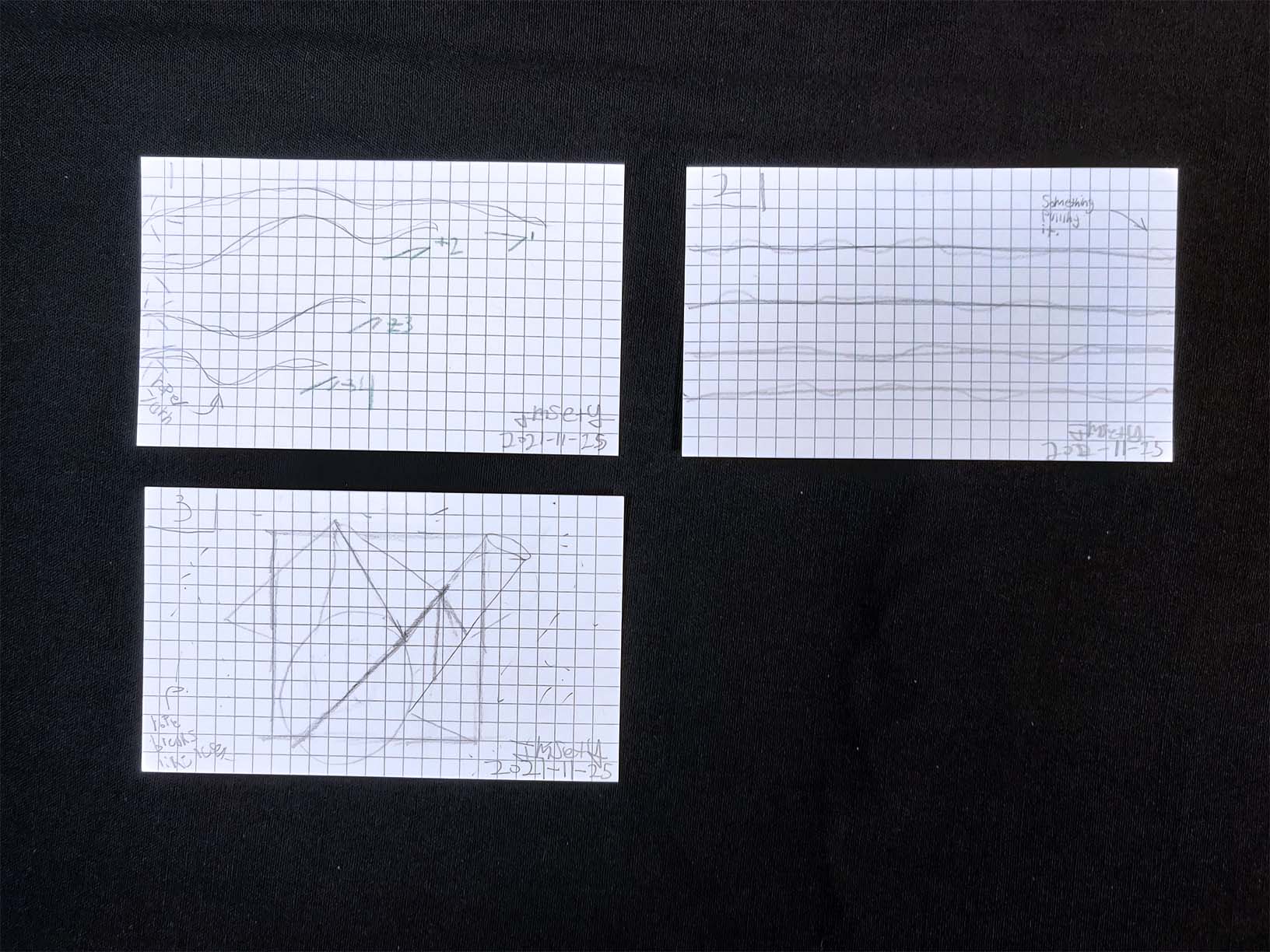
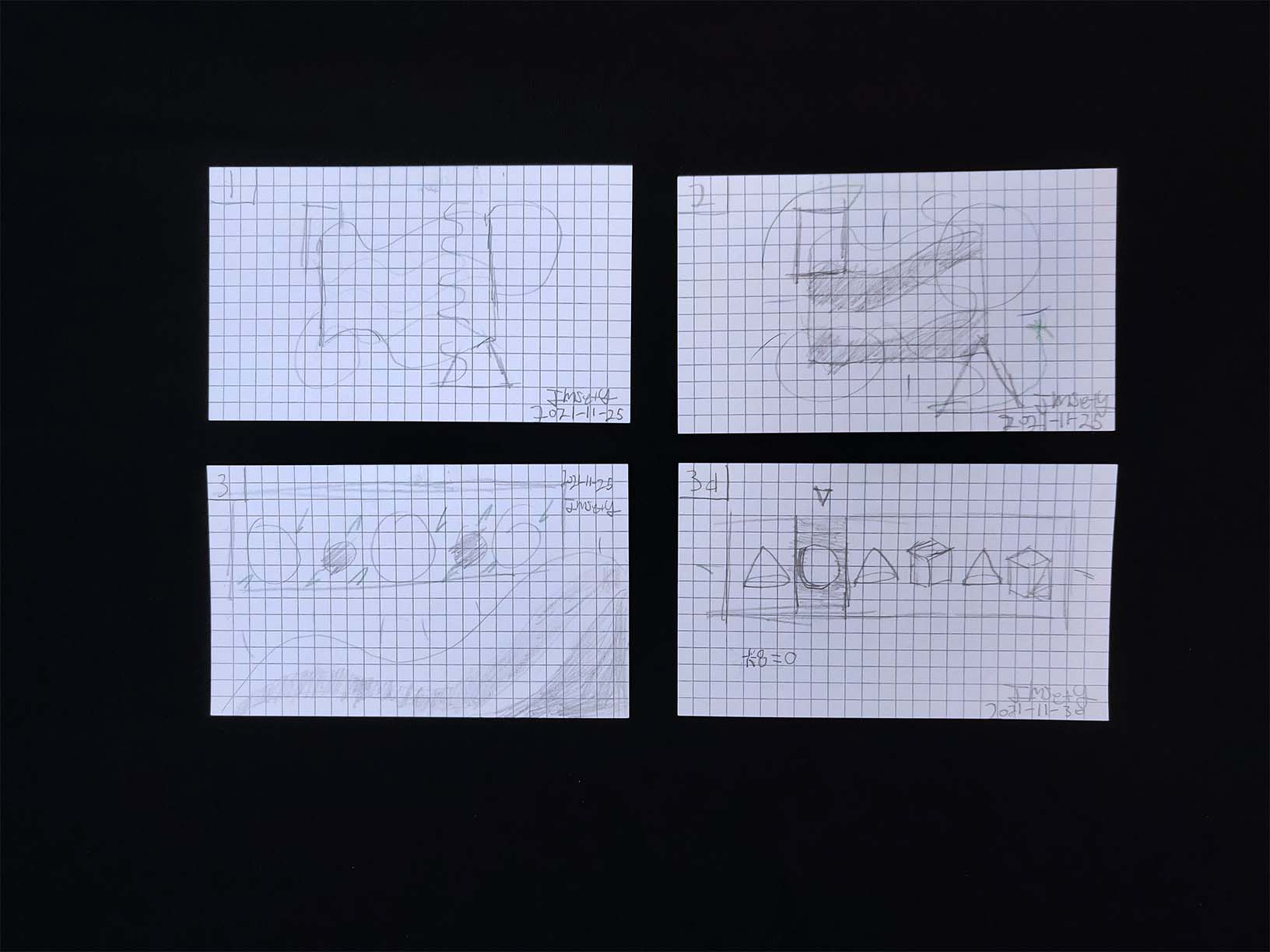
After conceptualizing the piece, I drew out a storyboard using index cards and sticky notes. The storyboard became the reference I used to create the styleframes.
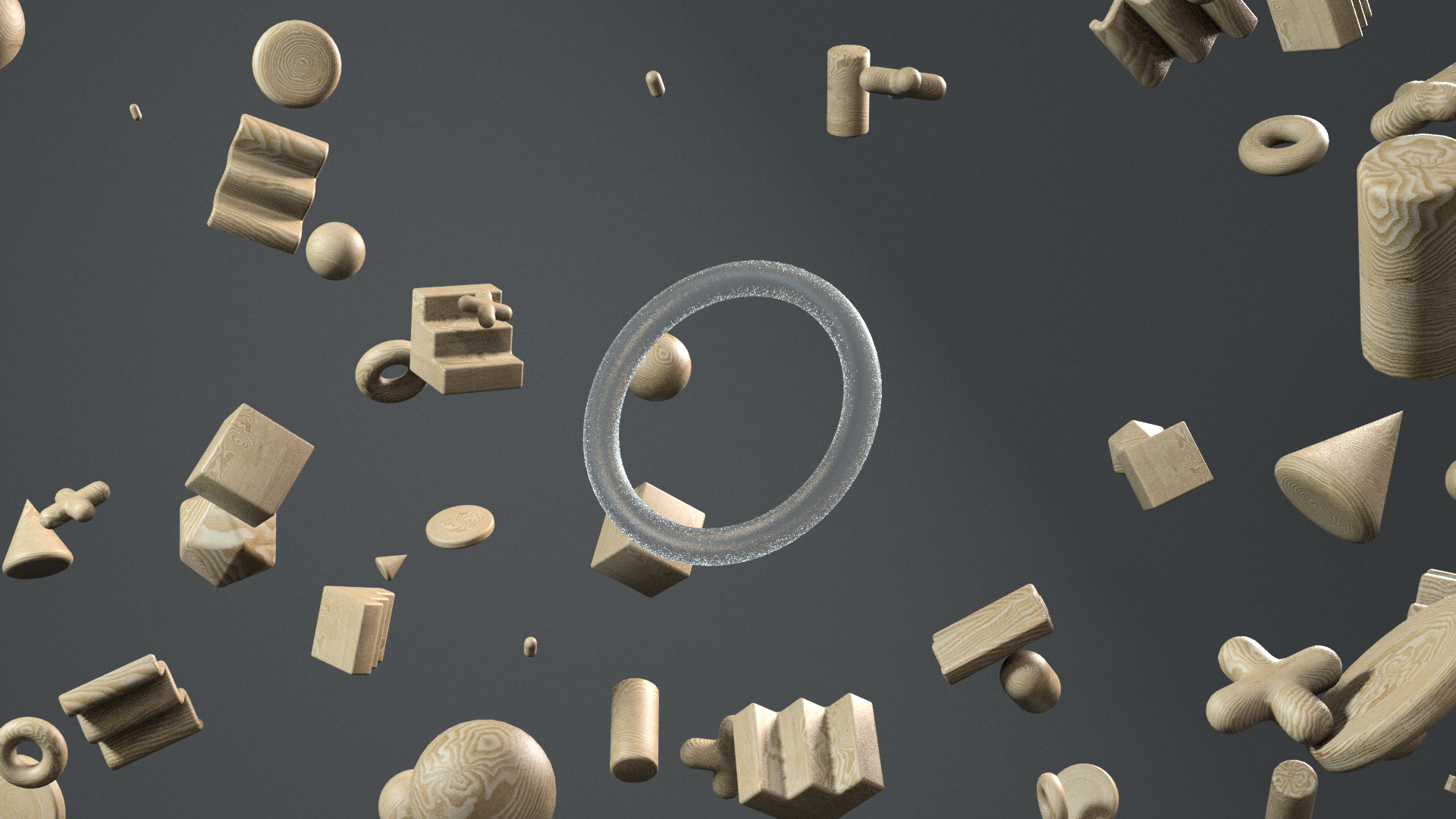
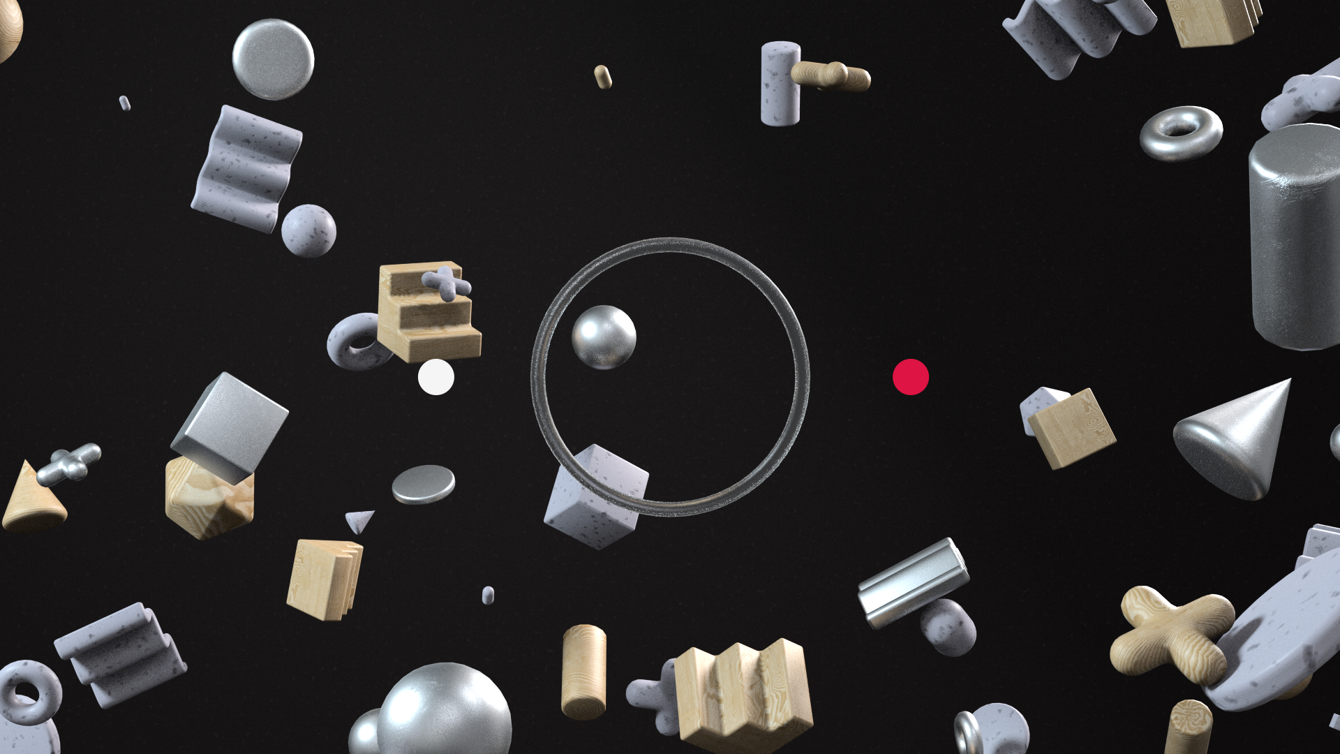
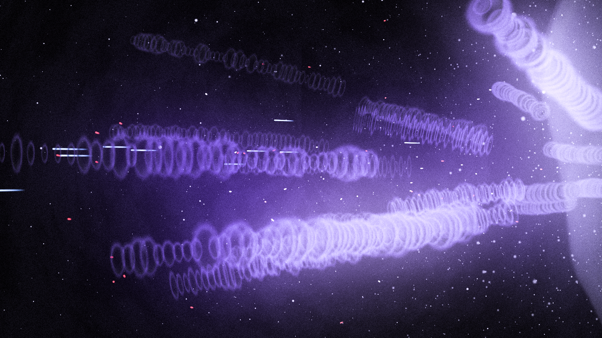
Act 2
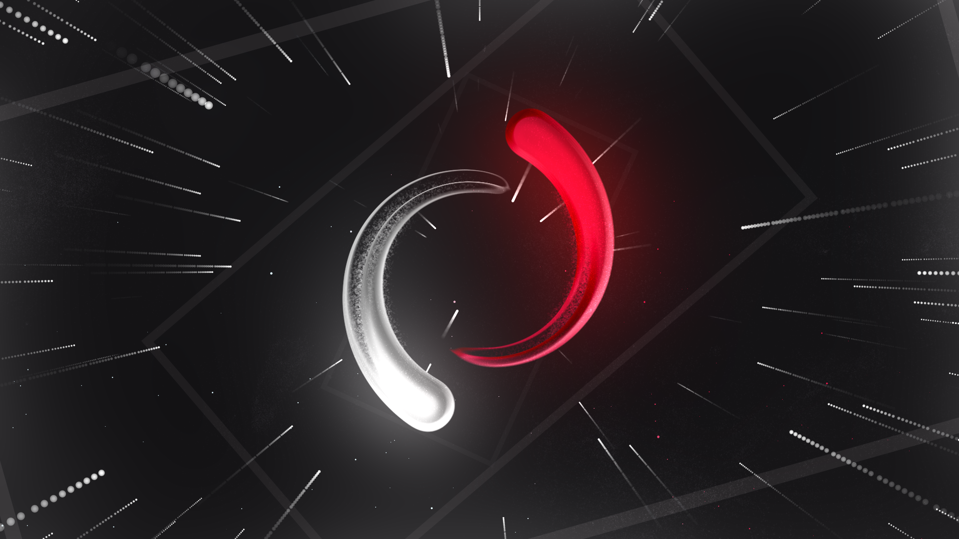
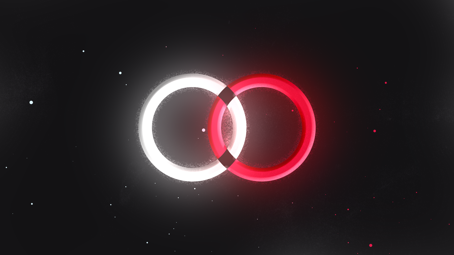
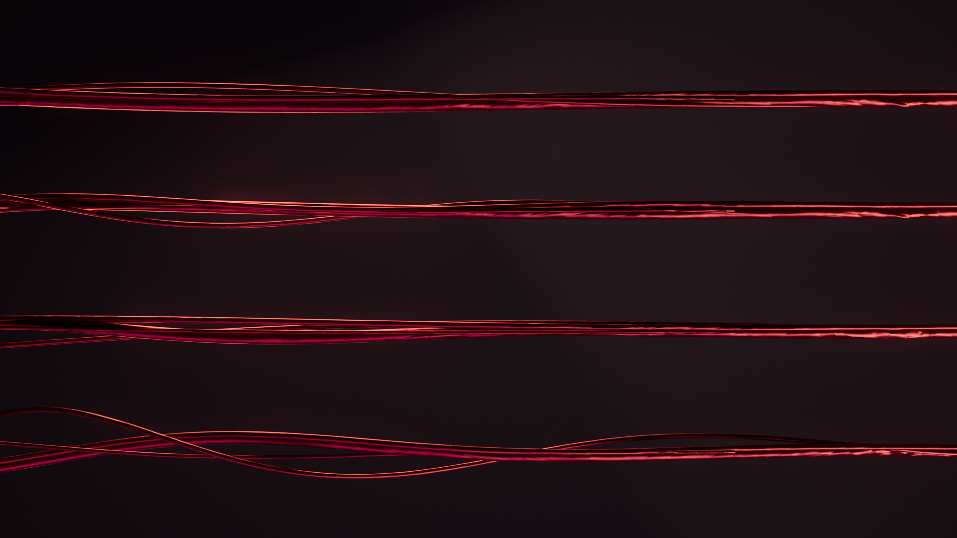
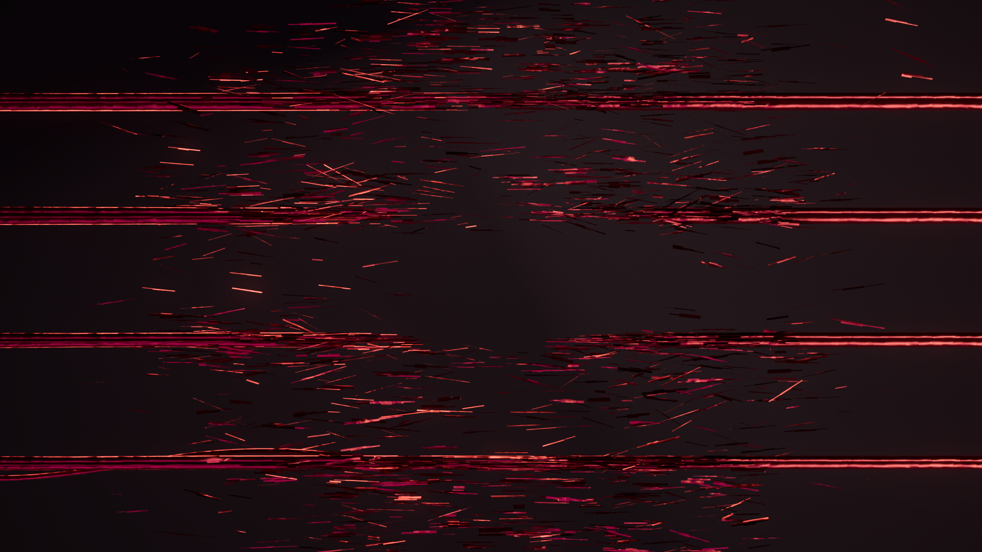
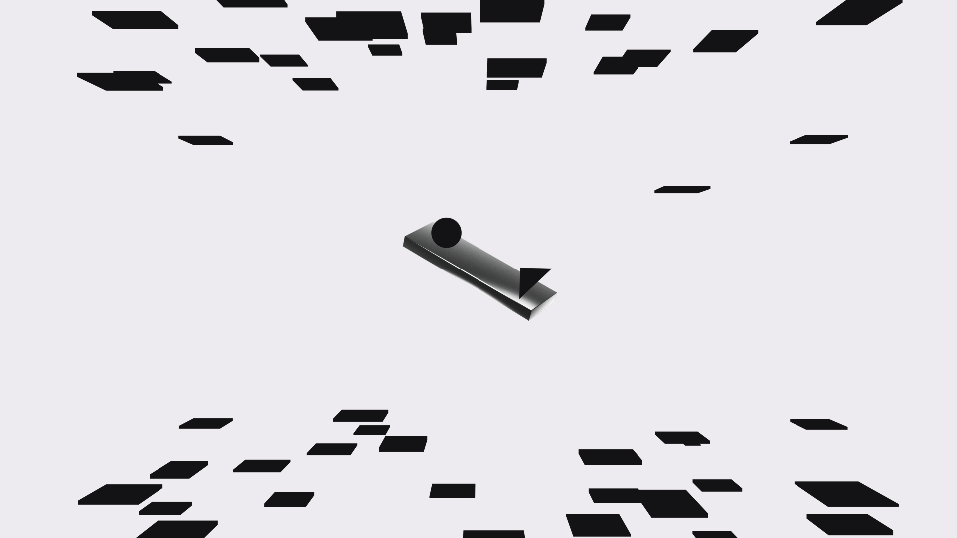
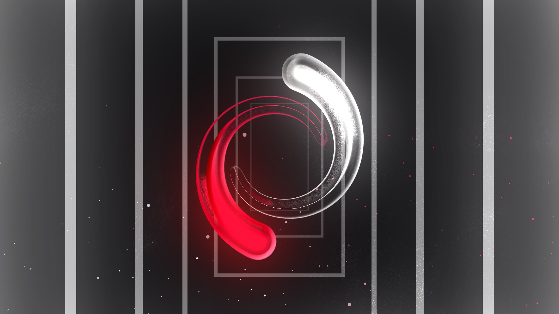
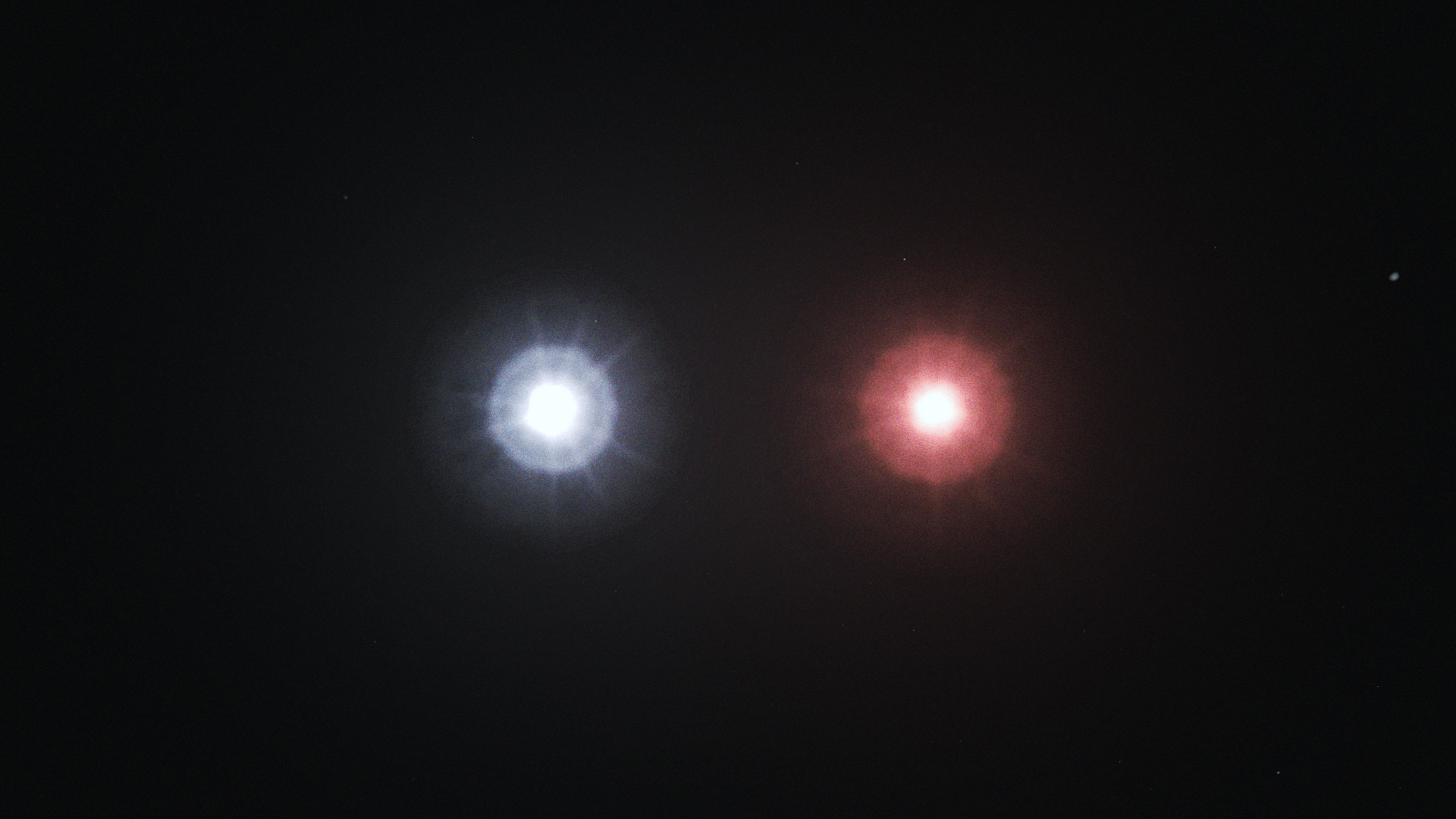
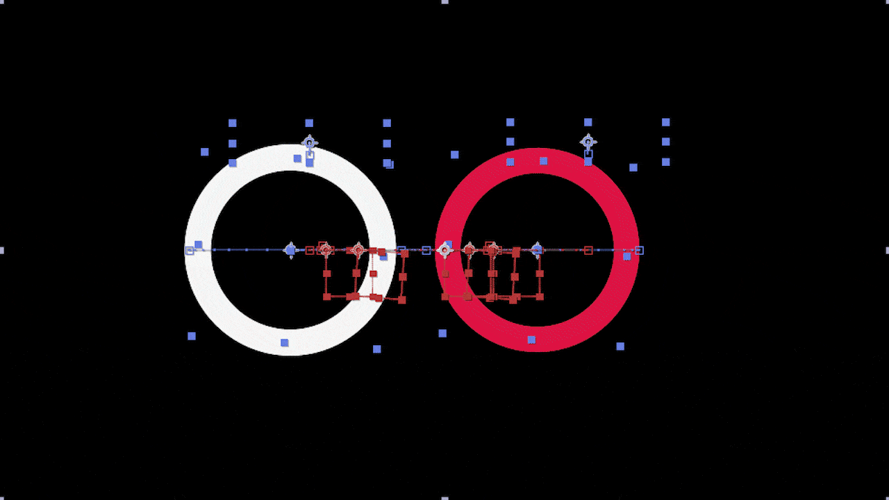
I wanted Act 2 to be about how far creative discovery can take you. I landed on the idea of having the viewer follow two dots that bear the white and red colors of the SetyMedia logo. Then, the dots takes various forms to represent the limitless imagination of what my identity could shift into.
Initially, there was a sequence where the two dots collided, and you go through a portal where you see two white and red orbs at the end of a tunnel.
Later, I realized that this interrupted the continuity of the two dots throughout the sequence. I scrapped that scene and came up with the idea of the dots turning into stars instead.
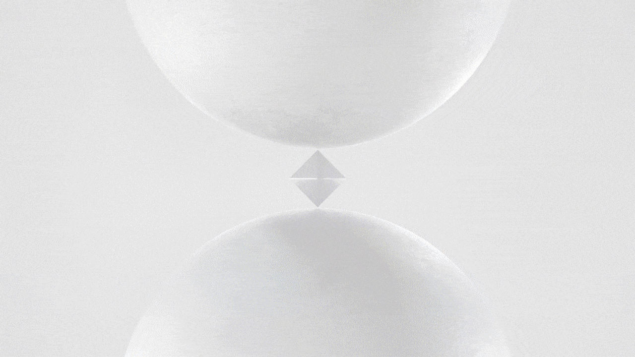
Act 3
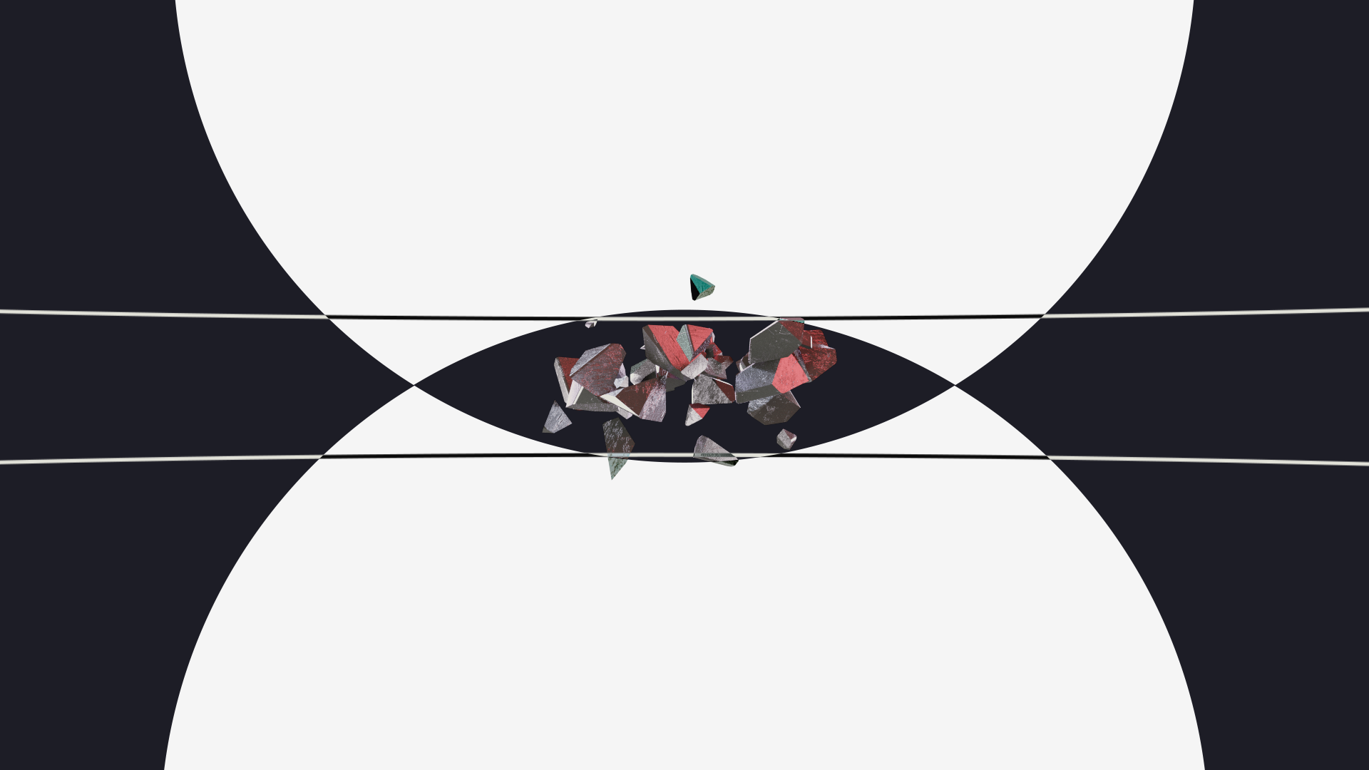
For Act 3, I wanted to have a grand firework finale—some form of centerpiece to represent the final stages of the transformation.
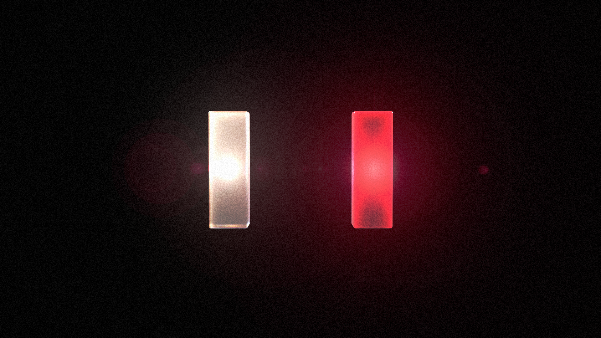
First, I dabbled with the letter "I" concept, with each part of it representing a different "island" of my creativity. You would see close-ups of each island growing into an abstract environment.
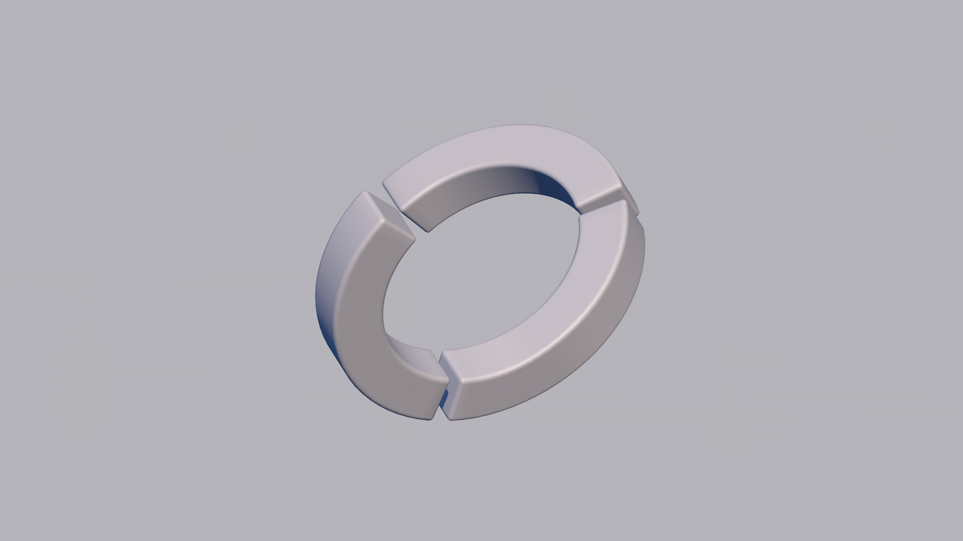
Then, I took the same concept but with an impossible circle sliced into three styles: nature, tech, and abstract shapes.
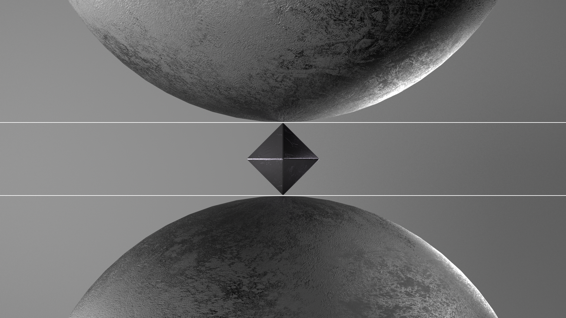
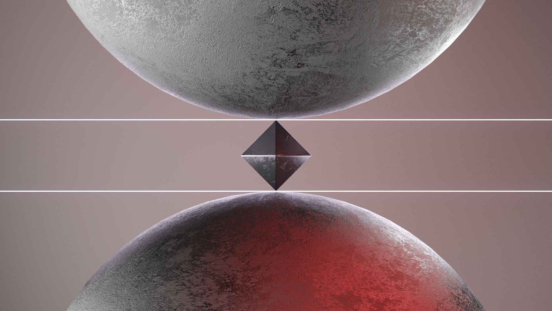
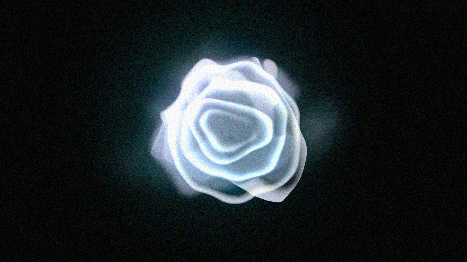
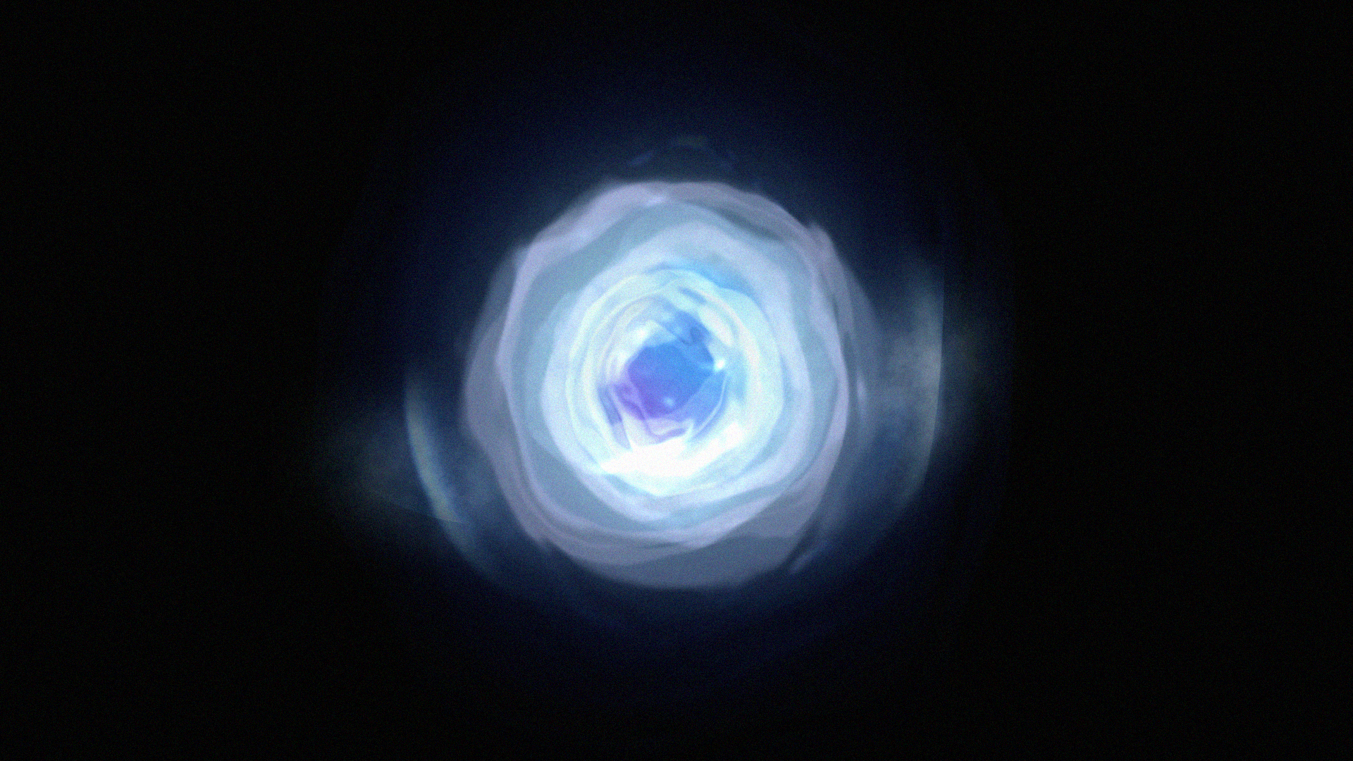
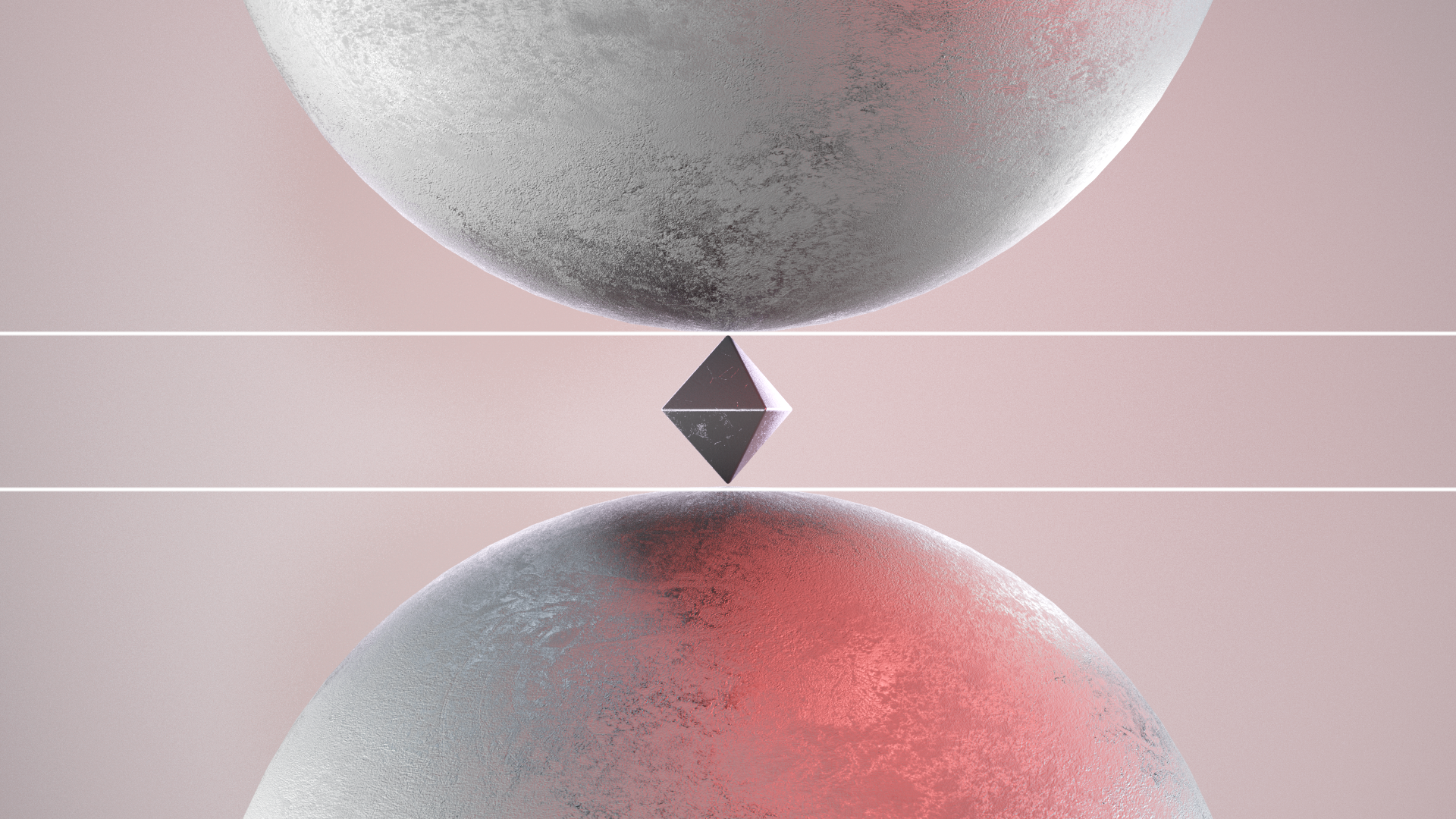
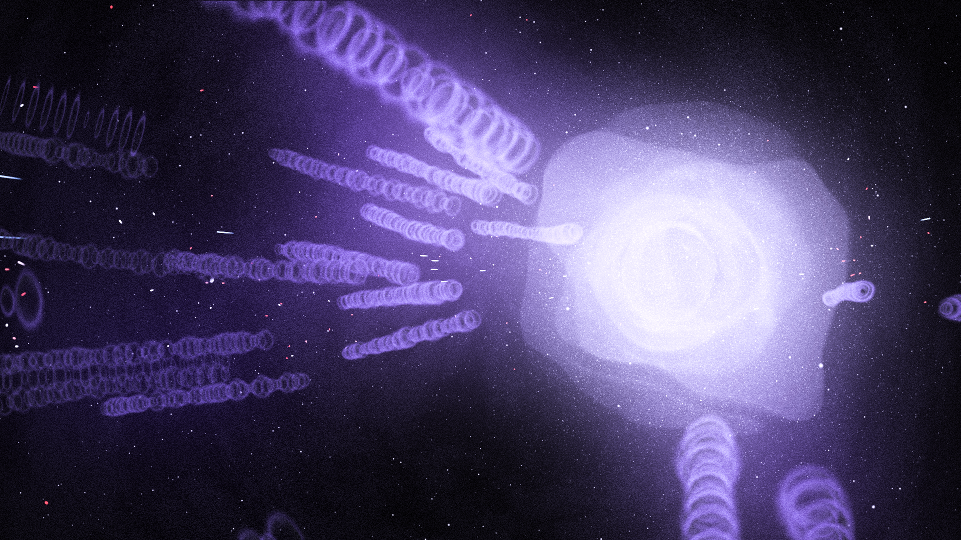
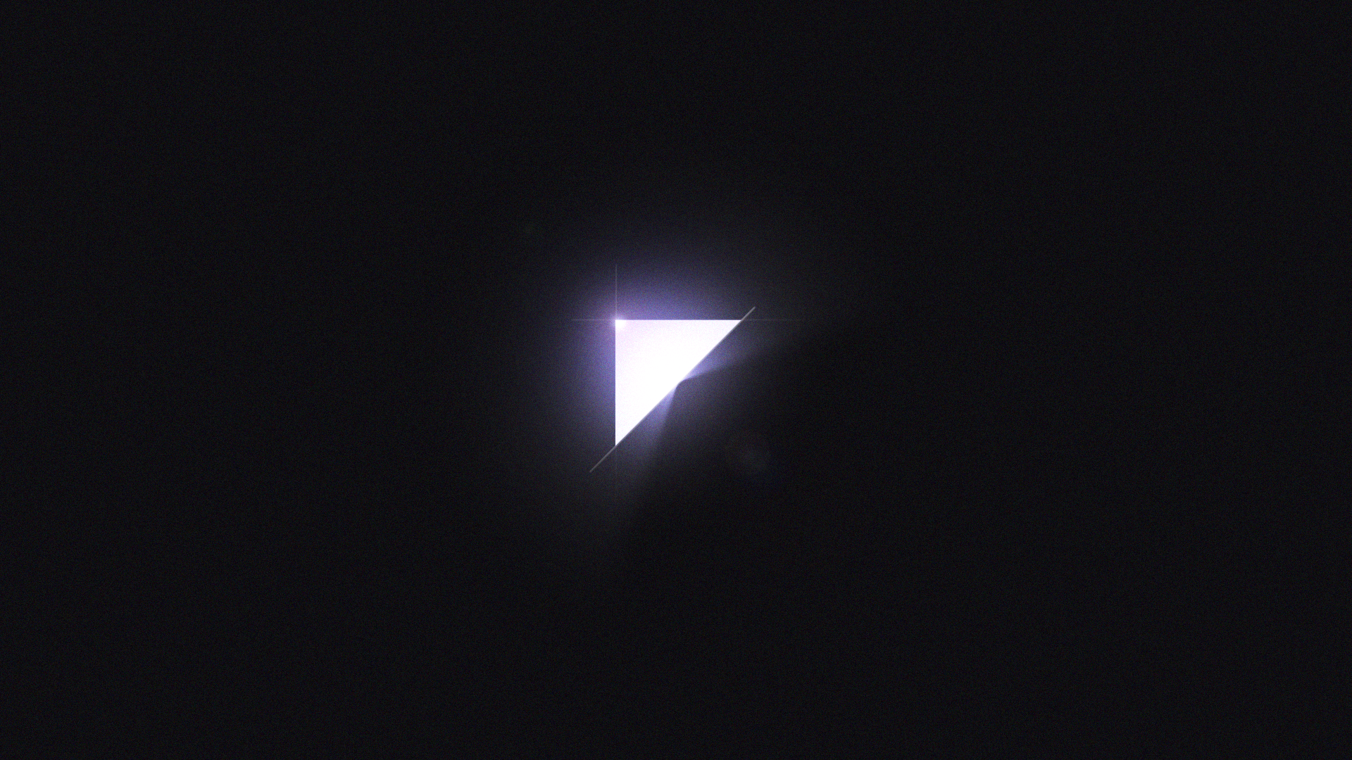
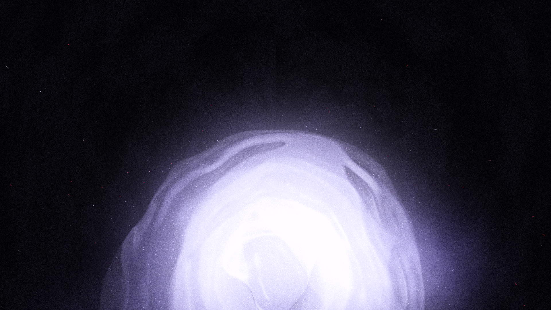
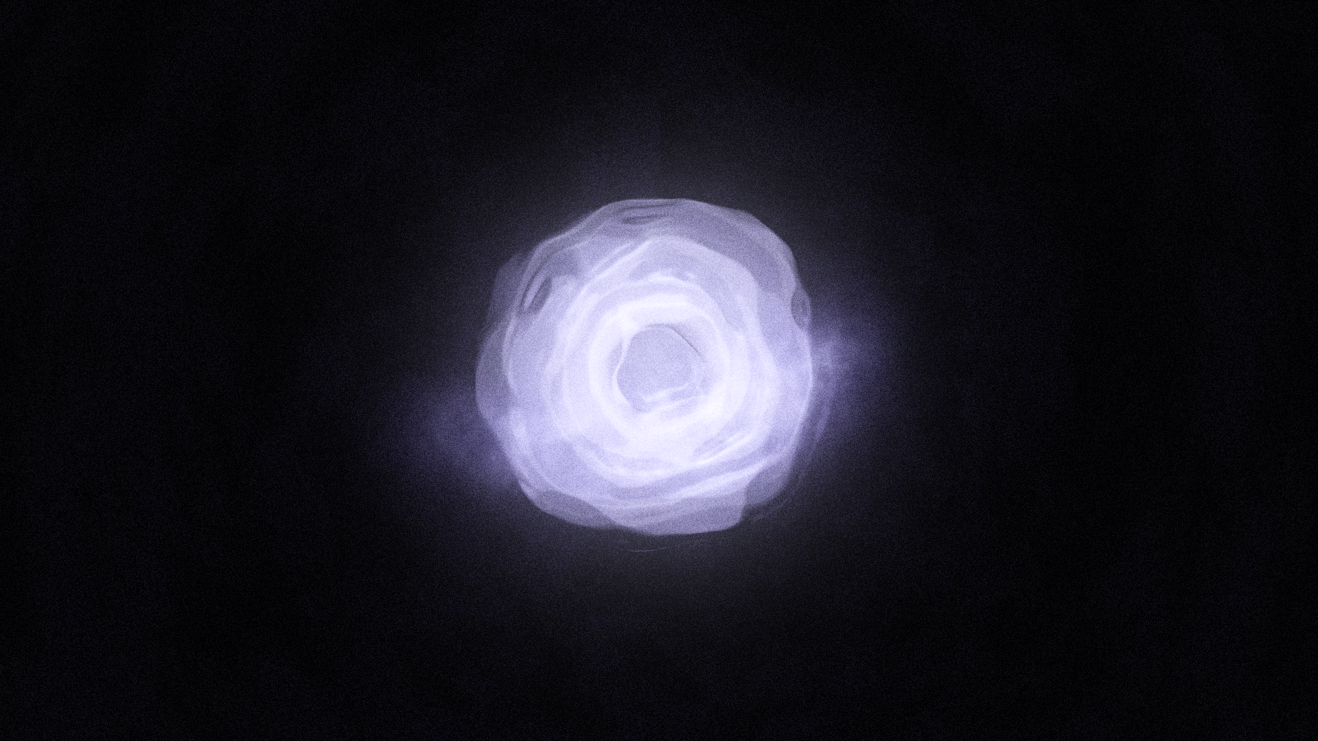
Finally, I settled with the idea of having the centerpiece be a sphere of potential energy, almost like the aftermath of a supernova. The works of Erica Anderson heavily inspired the magical look of what I call the "Wisp," which represents the final "loading" state of the transformation.
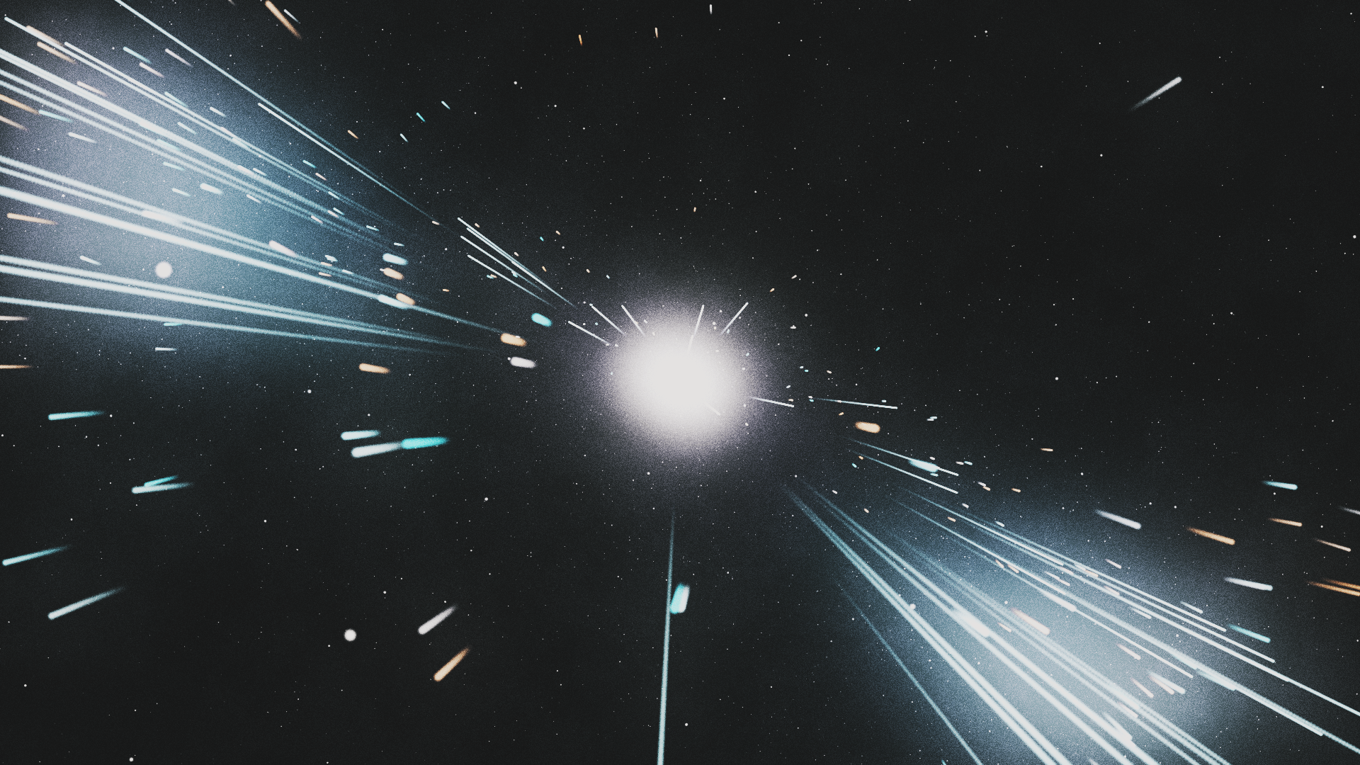

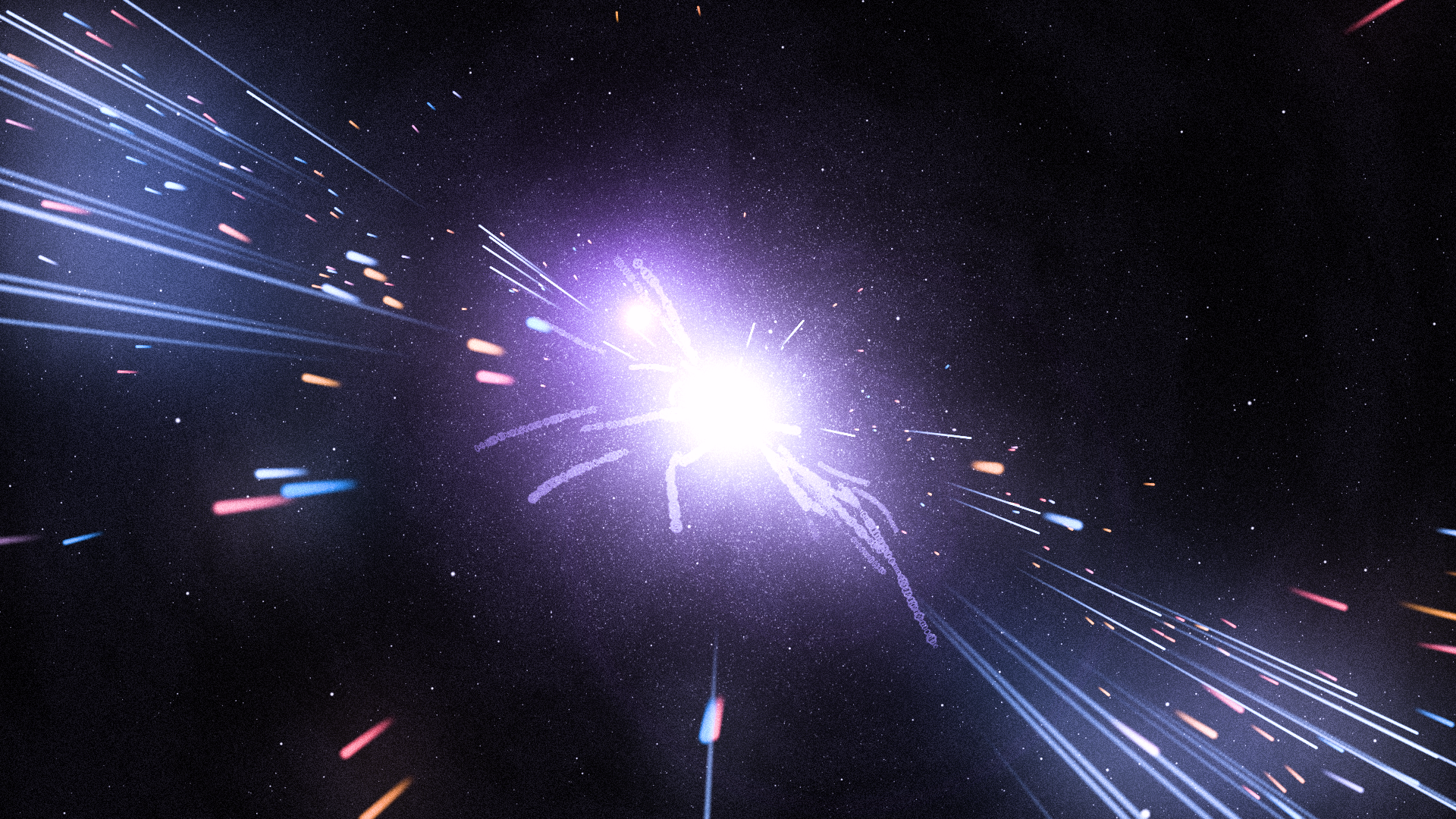
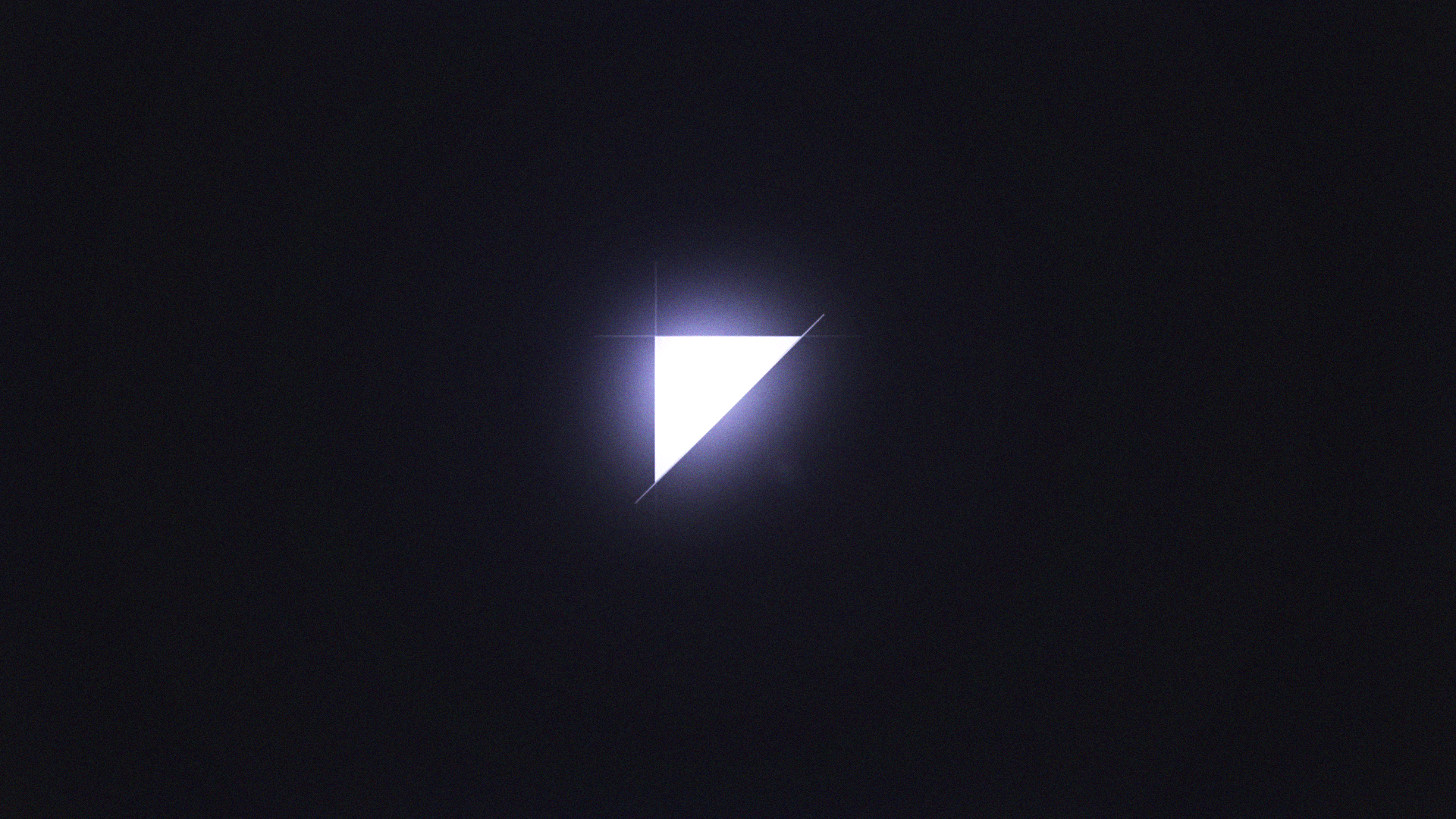
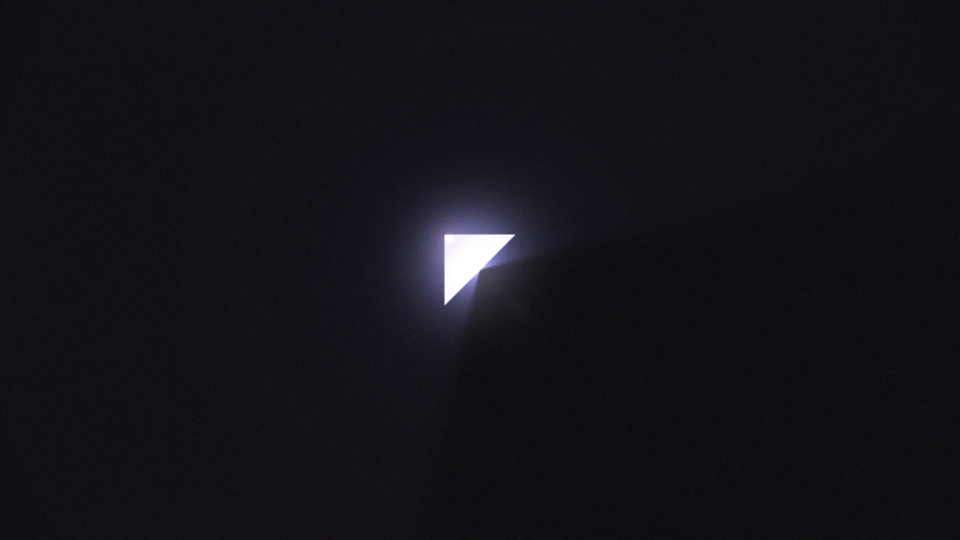
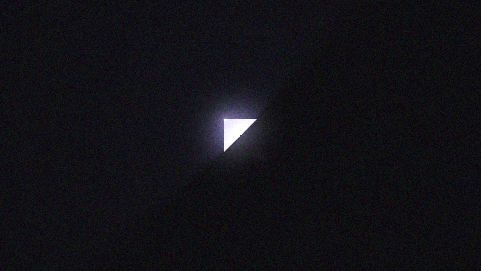
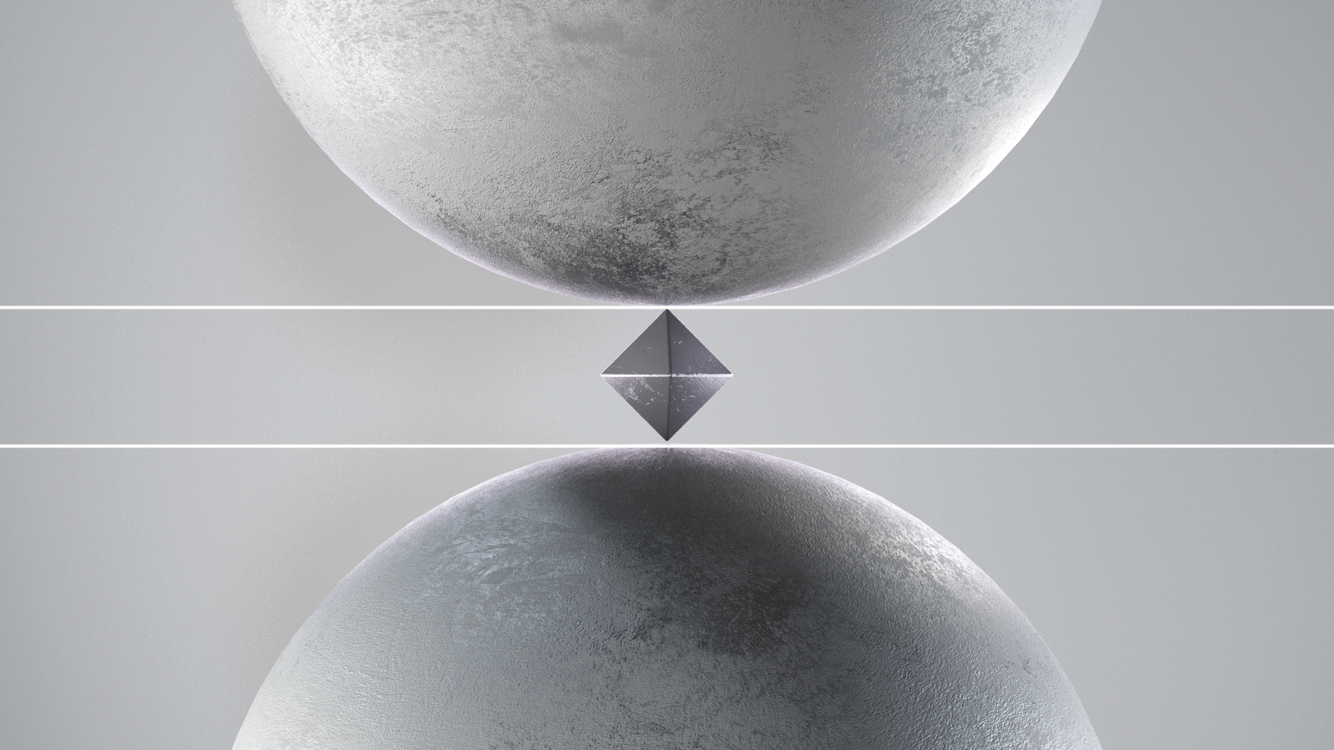
As the final act comes to an end, the new mark for my brand, an inverted right triangle, covers the Wisp, letting a little bit of its light shine through it. It's almost as if it's containing the energy created by this ominous entity, holding back consecrated creativity.
Intermittent videos
I had the idea of making musical "intermittent" videos that represent the ongoing process that the Wisp is going through, where the viewer takes a "peek" into what is going on inside of that mysterious intergalactic ball of creative energy. It's almost as if it's incubating new creative ideas, trying to find its final form. I wanted these videos to act as somewhat of a teaser for the final brand reveal.
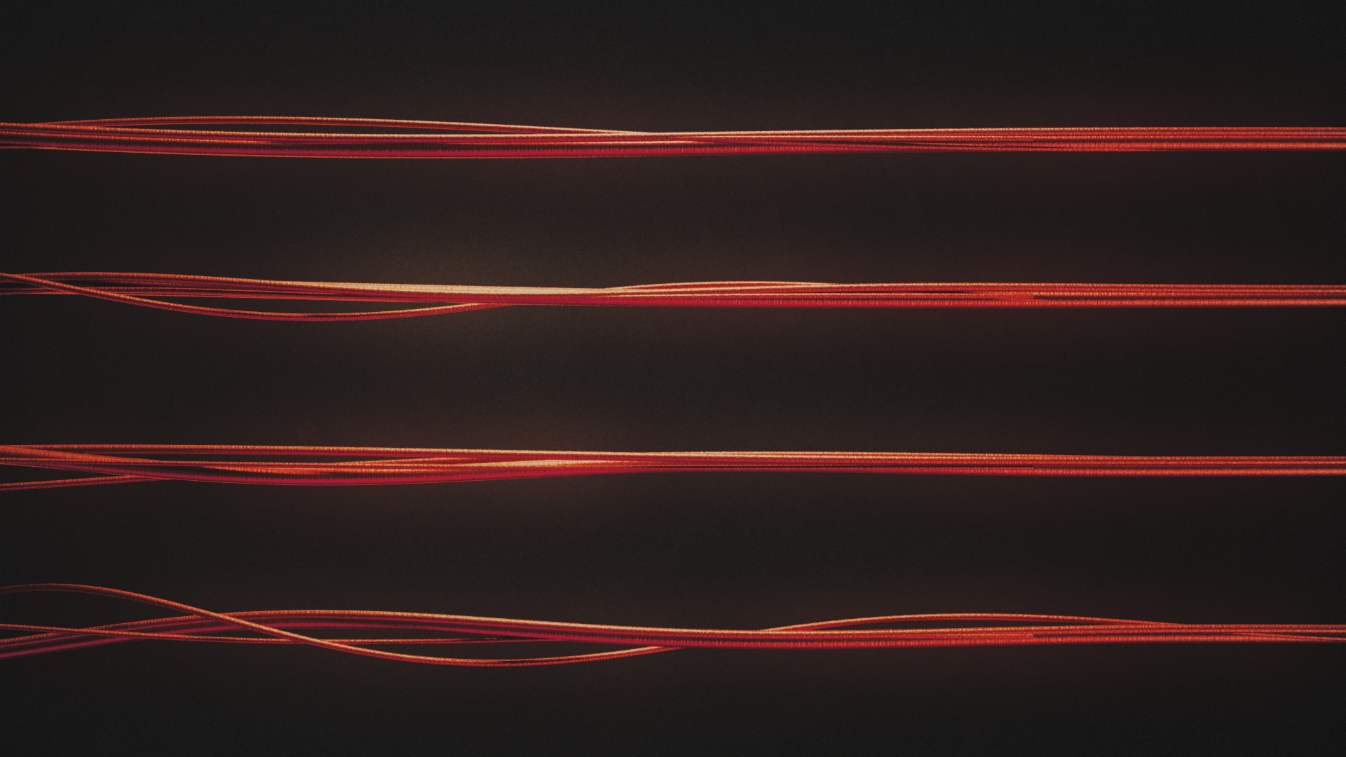
Red Ropes
"Red Ropes" is a short visualizer that I came up with after producing a beat that samples Easy To Be Hard by Three Dog Night. I wanted to make this visualizer reflect the music's retro and "crackly" nature.
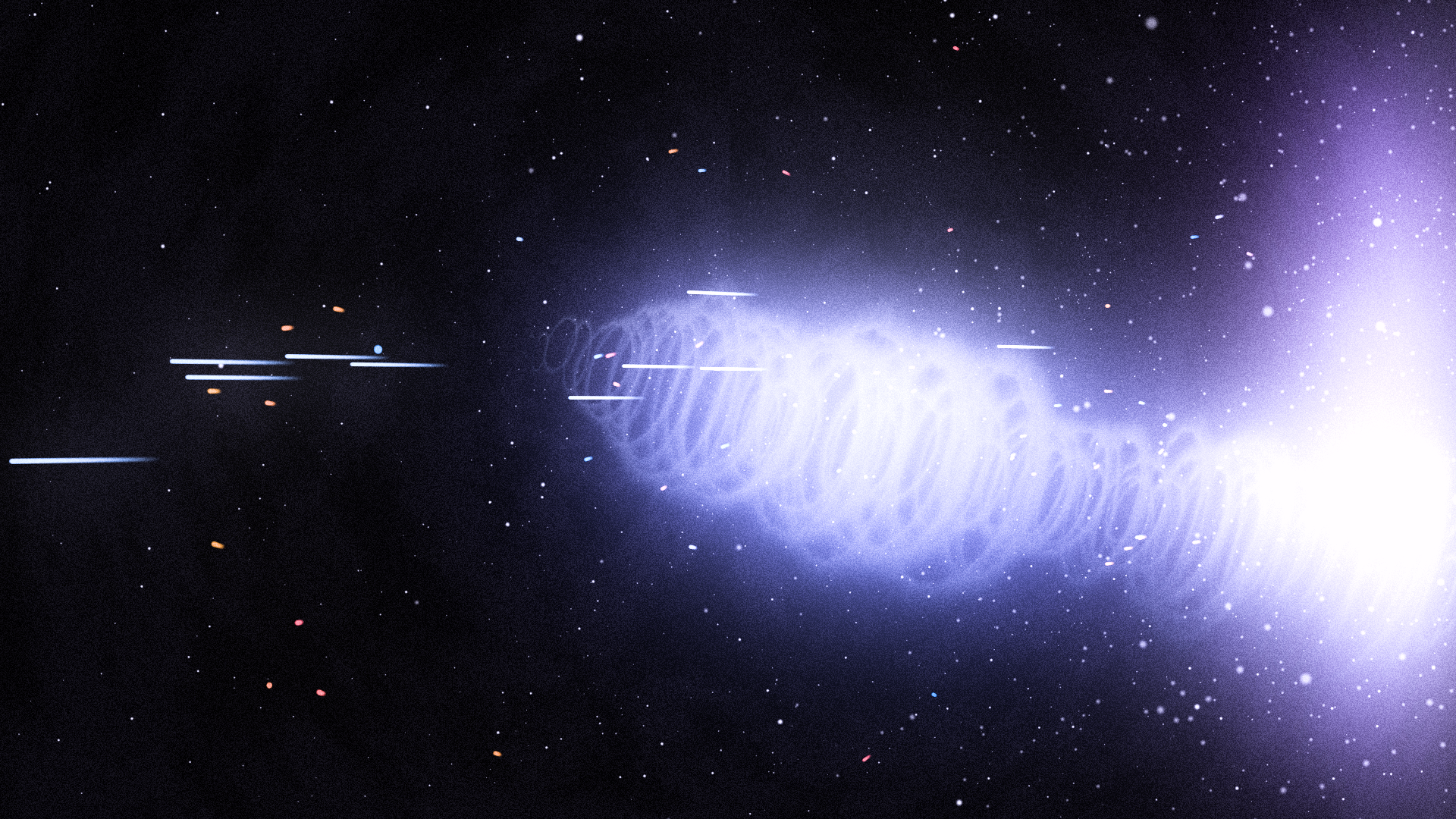
Acoustic Wave
Orginally sampled from Workinonit by J Dilla, "Acoustic Wave" is visualizer that depicts an abstract wave being moved by the gutiar's hard rock strum.

The Seesaw - Brand identity reveal
"The Seesaw" acts as the final set piece for this rollout. The Wisp is done incubating, and it's ready to release all of its energy to unveil the definitive and final form of the personal brand. The instrument from this beat was sampled from the talented harp player Madison Calley.
Branding and identity
One of my favorite elements in design is when something looks seemingly simple on the surface yet deeply complex on the inside. With this philosophy in mind, I approached the look and feel of the visual identity with simplicity and minimalism. Another goal of mine was to have the meaning of the identity align with the ancient Egyptian orgins of my name.
Right triangle meaning:
- Emotion. The shape of the right triangle resembles the silhouette of a liver. In ancient Egypt/Kemet, Imsety was the protector of the liver. It was said that the liver was the seat of human emotion. This concept conveys my desire to capture memorable experiences in my work.
- South. Imsety was also known to be associated with the south. The right triangle can be interpreted as an arrow pointing southward.
- Precision. The right triangle is a mathematically perfect 90-degree shape, representing my systematic approach to design.
- Simplicity. The rudimentary shape of the right triangle conveys simplicity, representing my minimalist approach to my design philosophy.
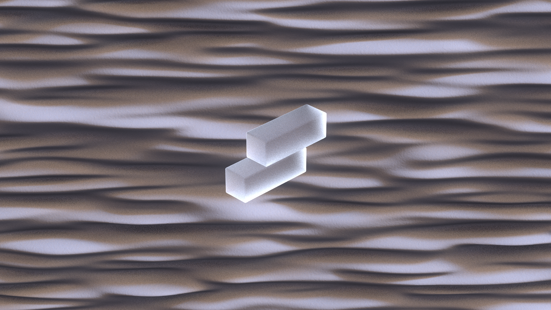
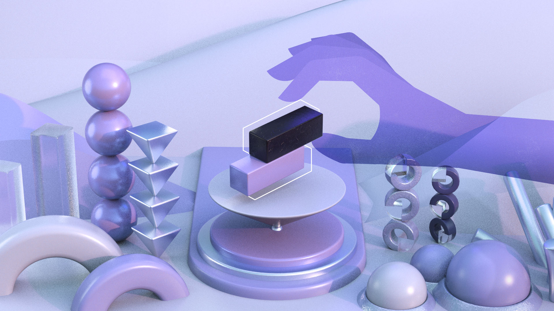
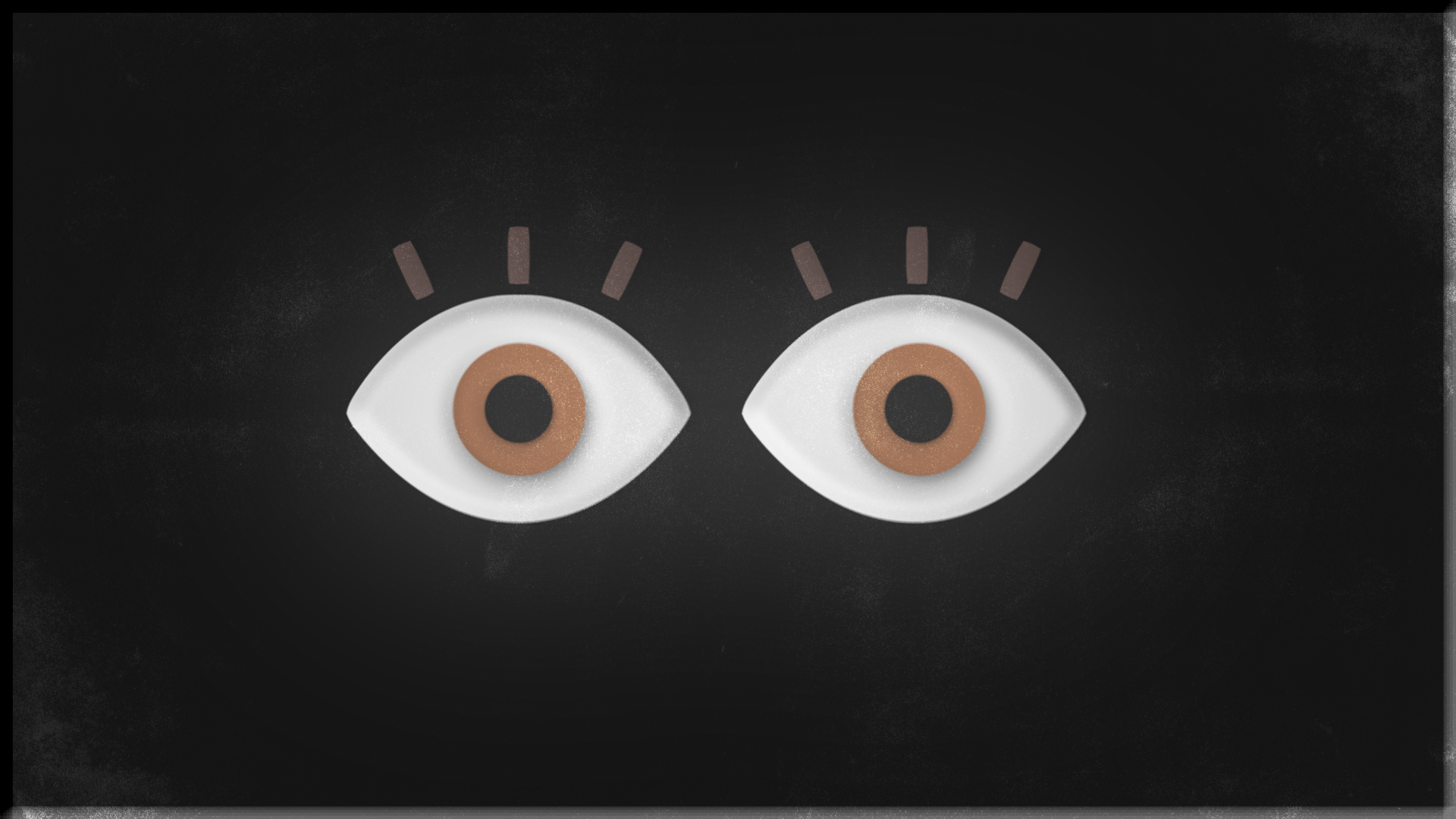
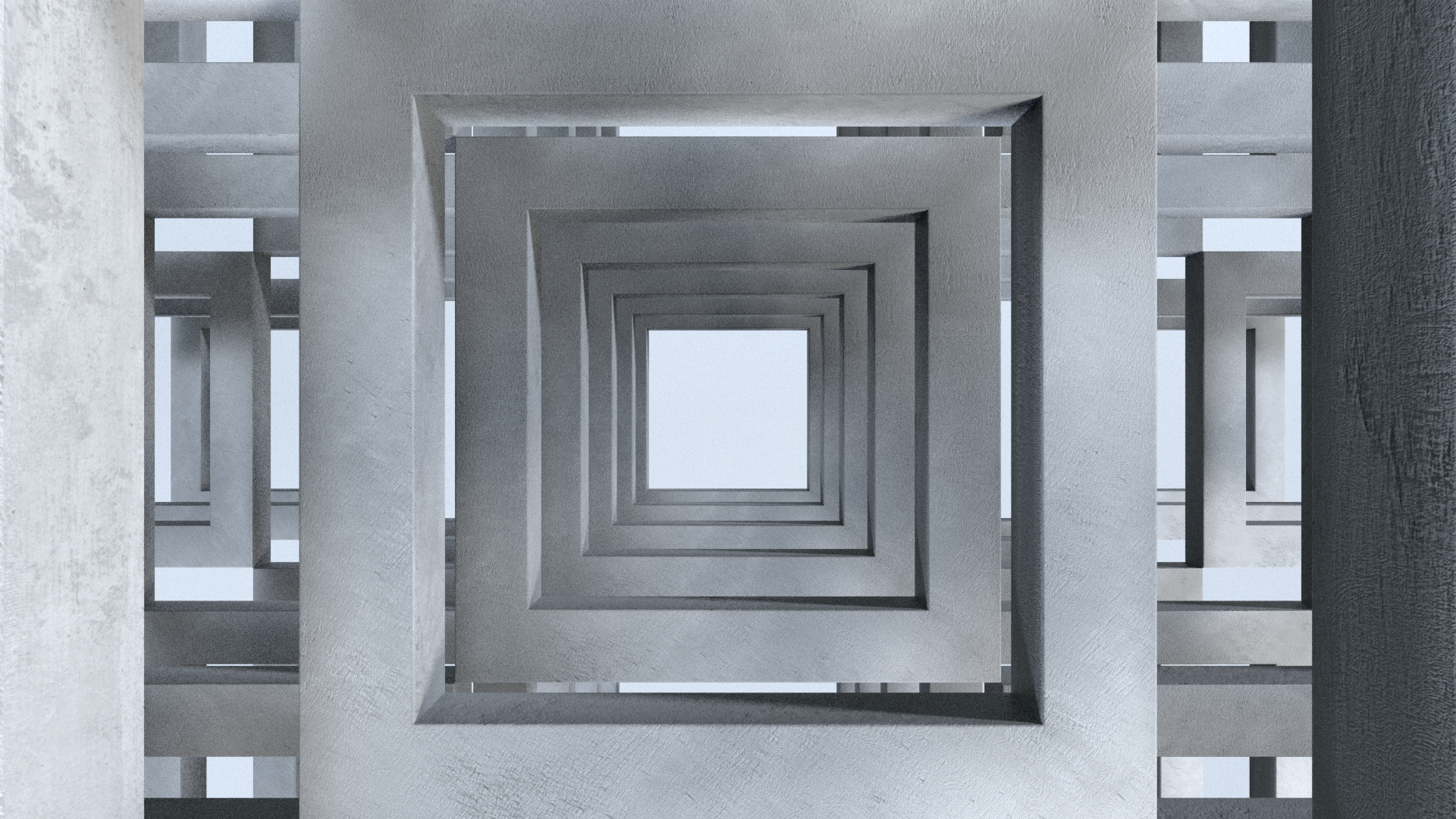
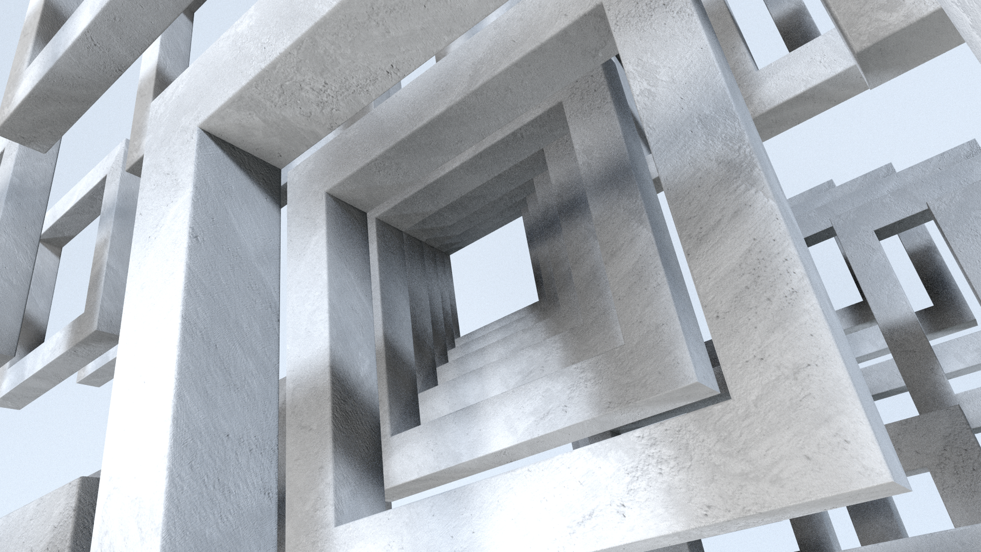
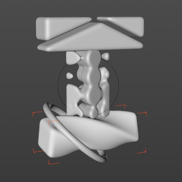
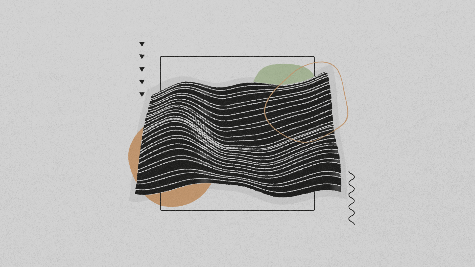
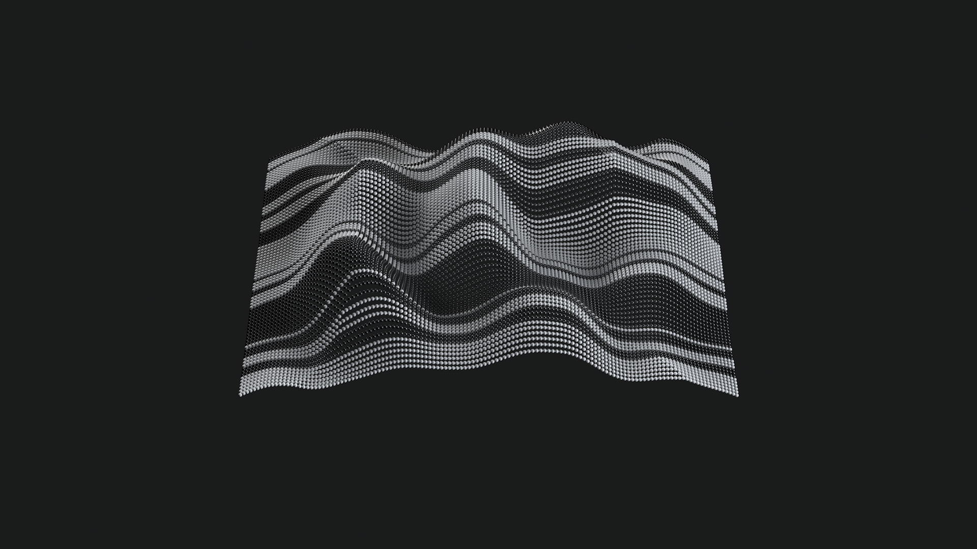
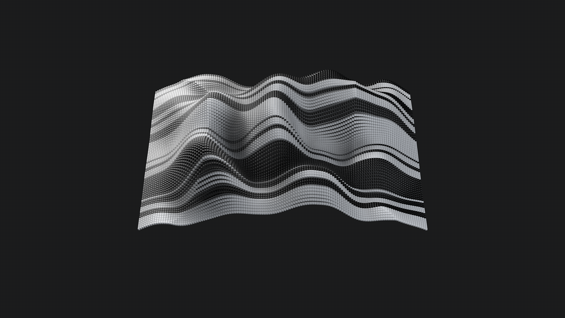
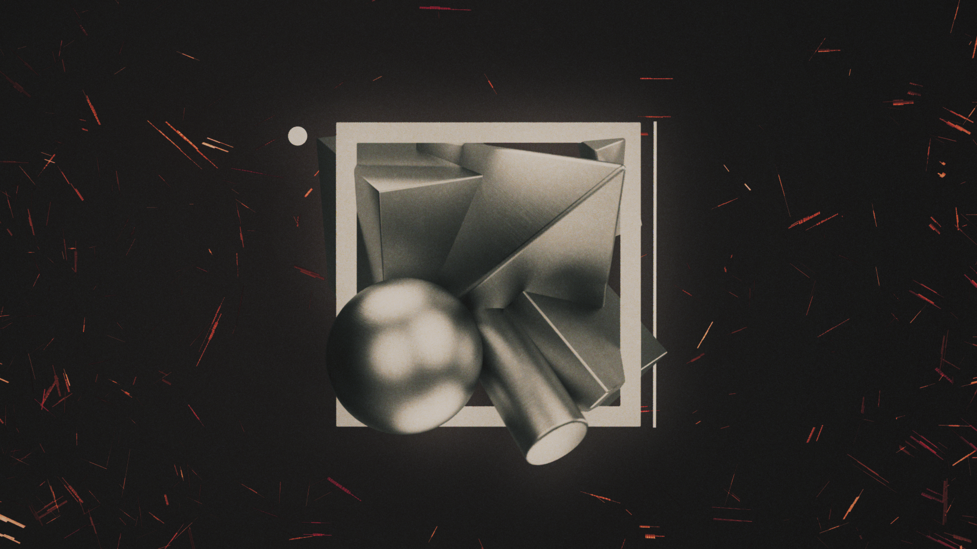
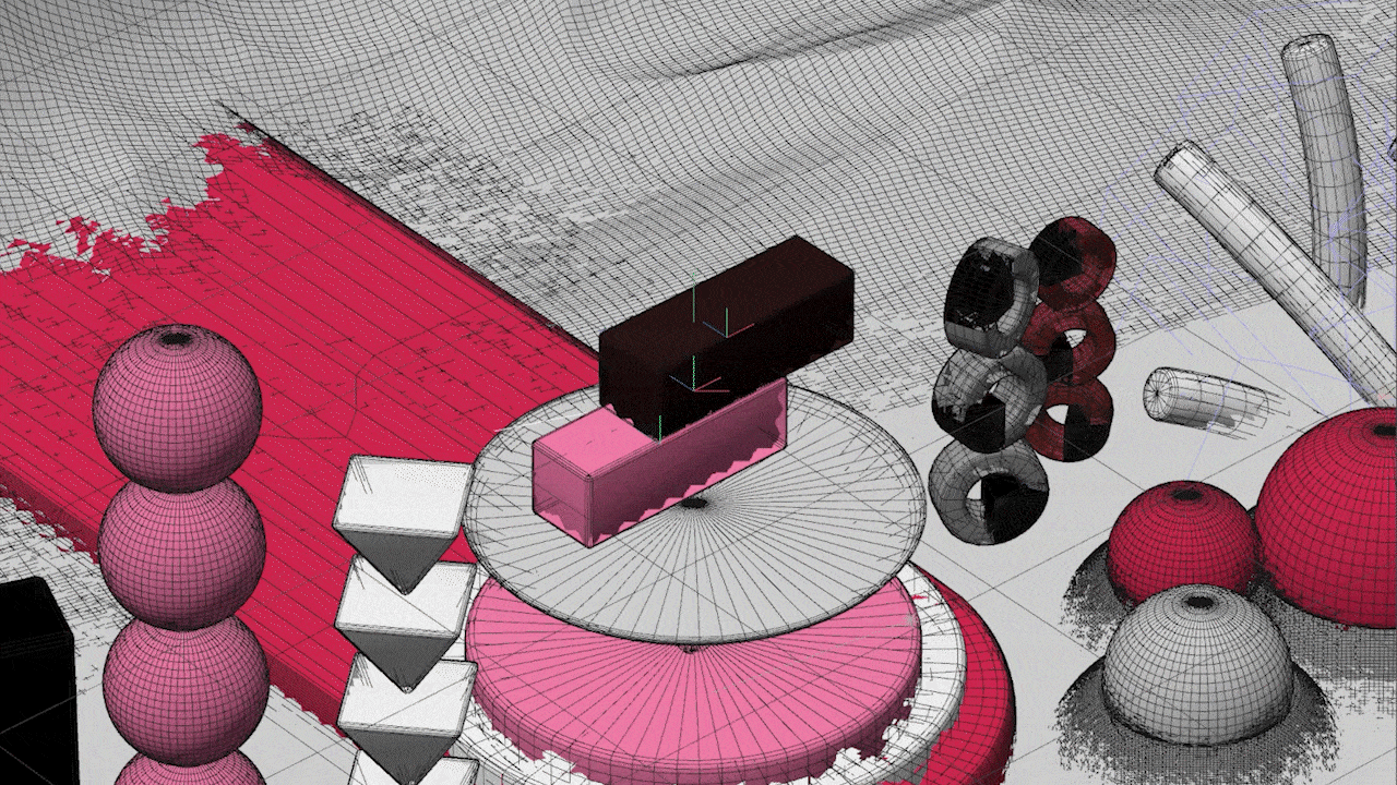
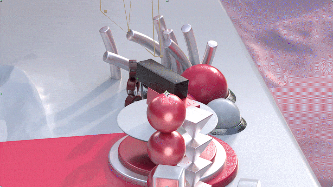
Stillframes
Here are some of my favorite high-quality stills from this piece!

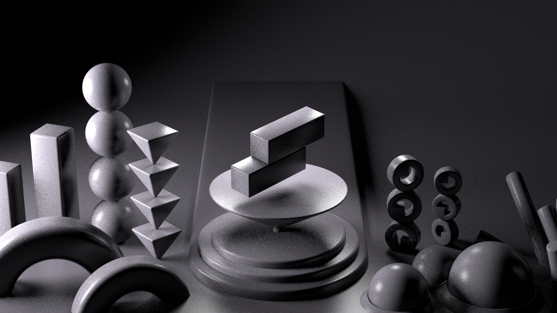
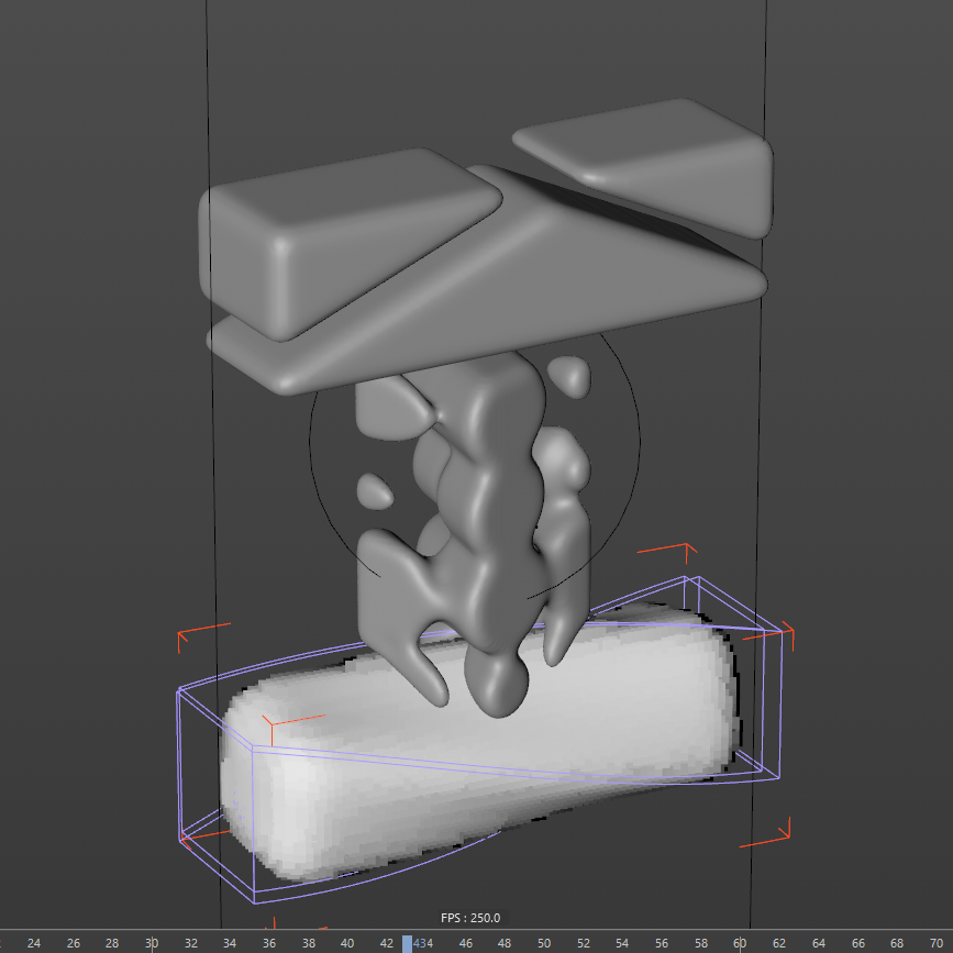
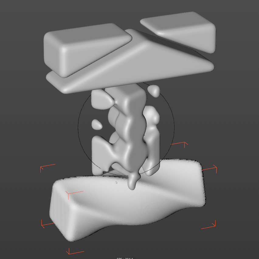
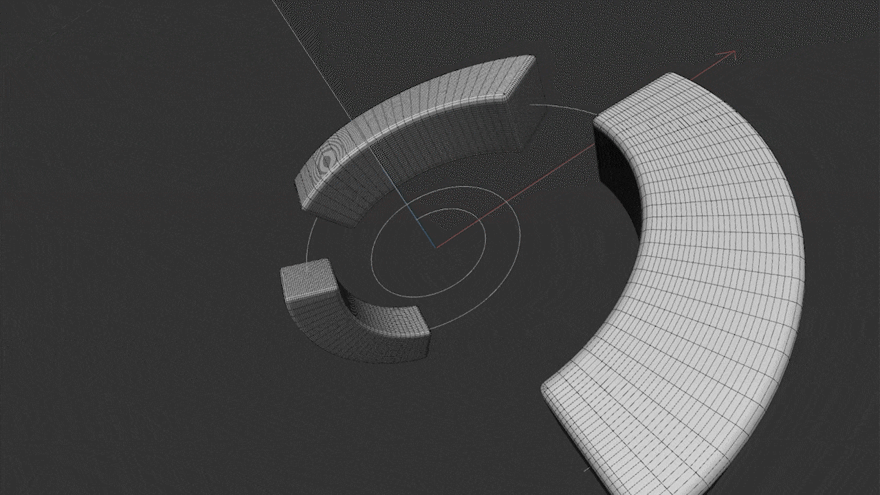
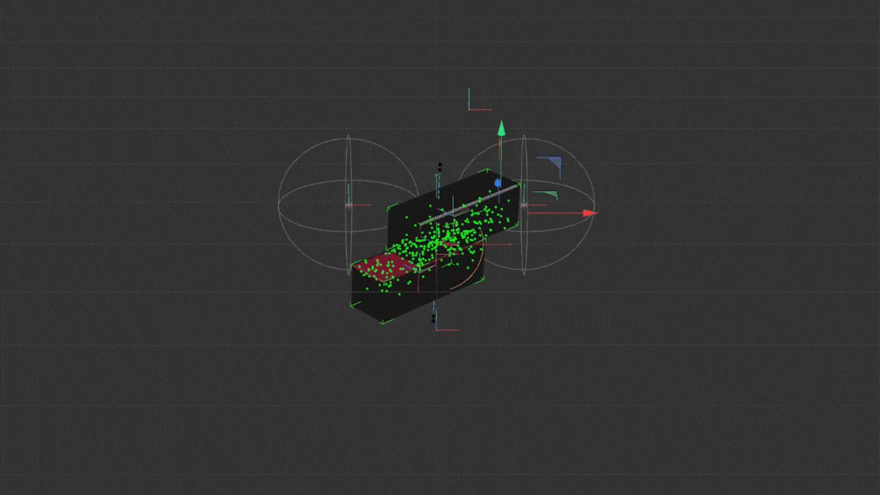
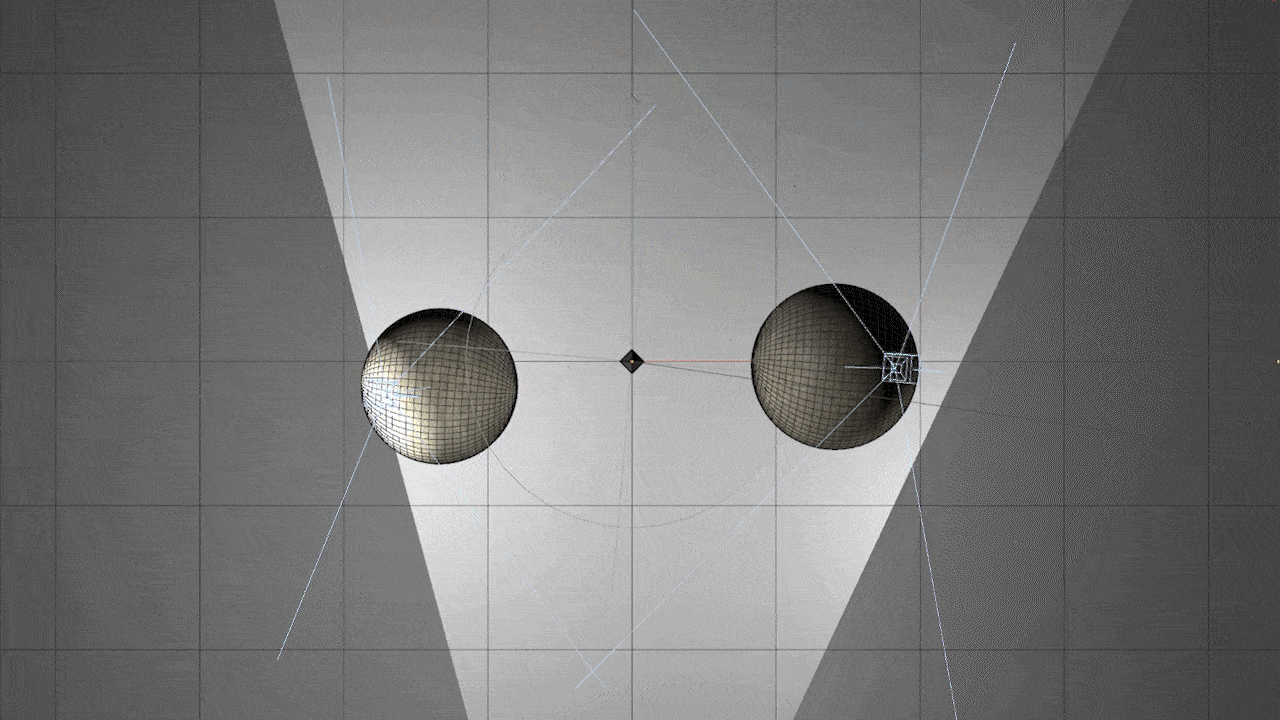
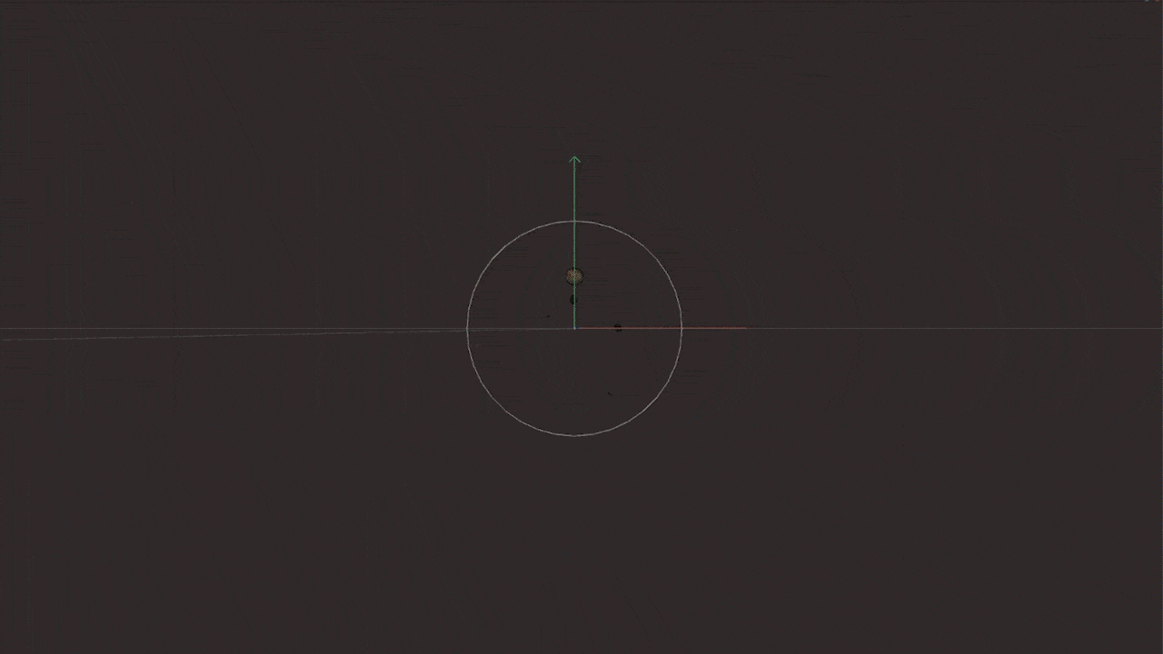
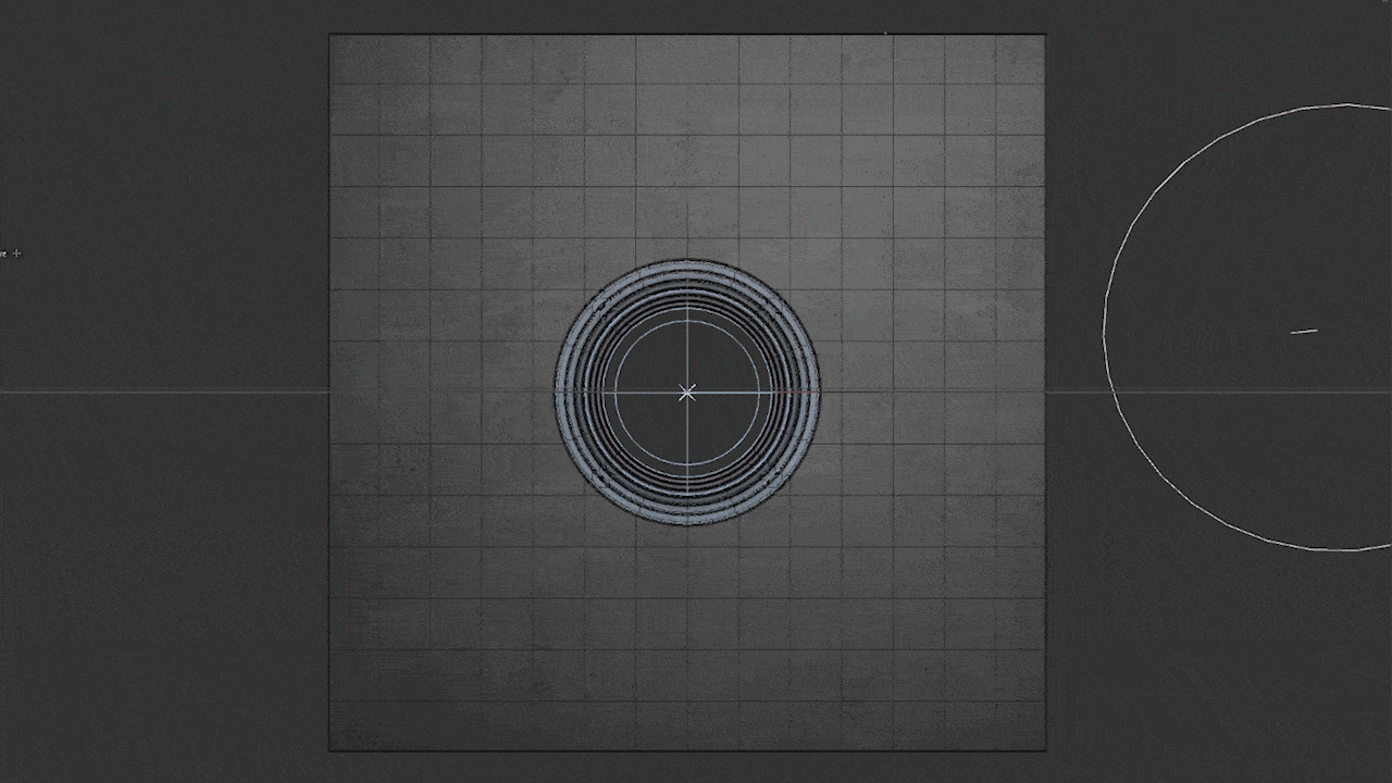
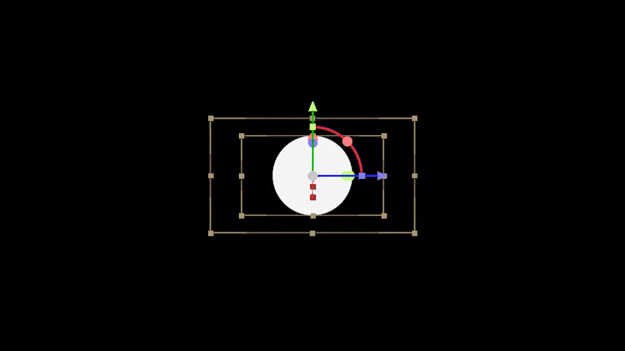
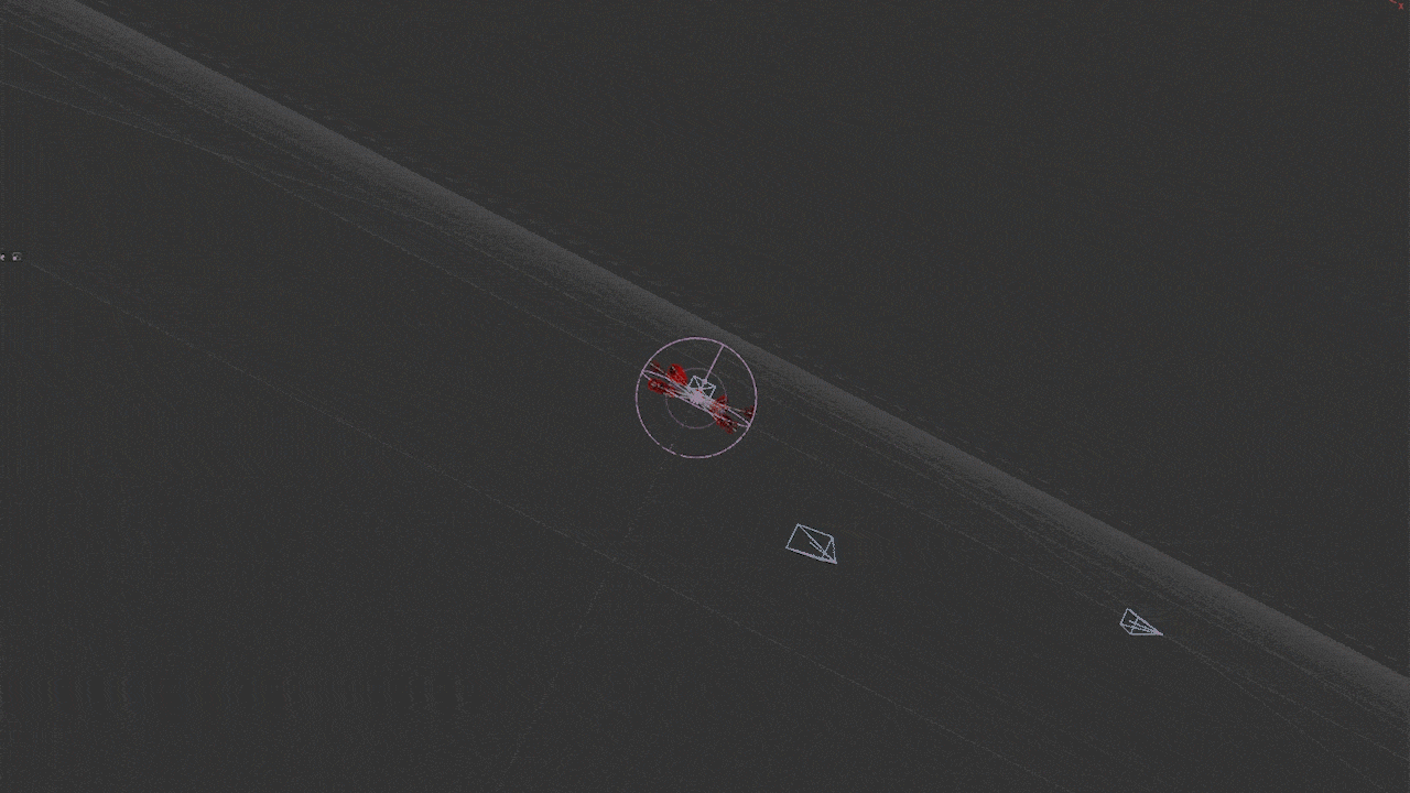
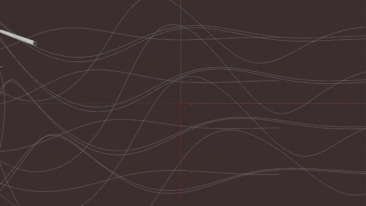
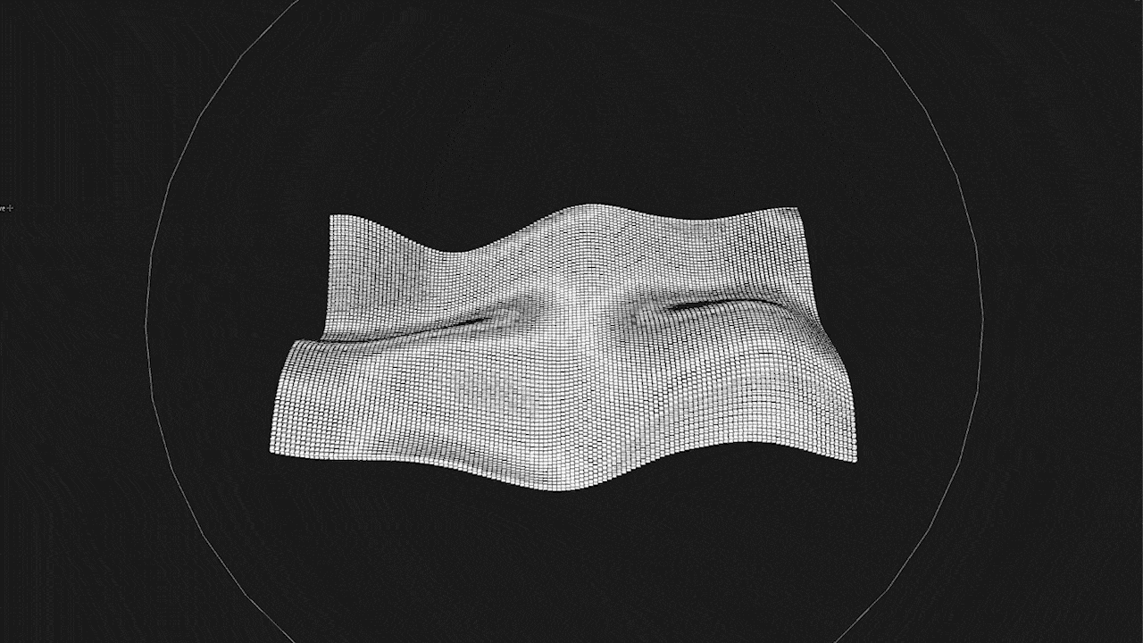
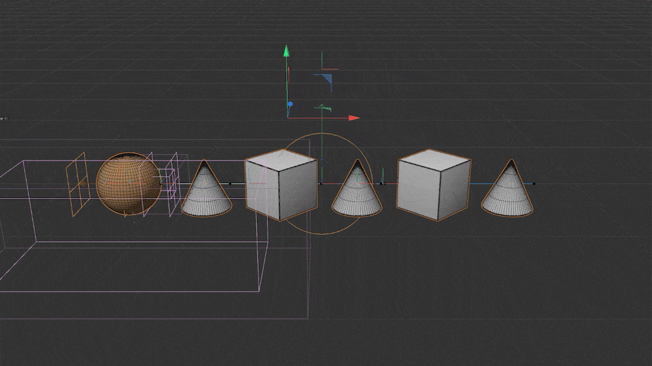
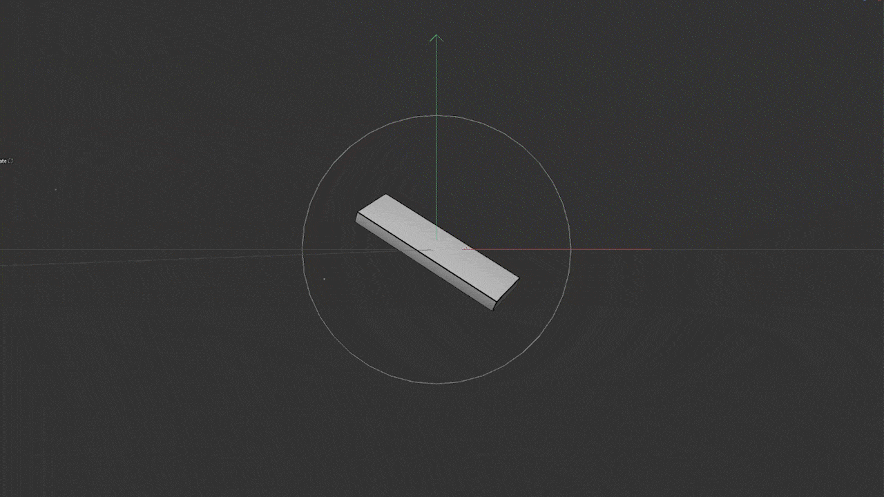
Wireframes

Conclusion
A lot has happened to me during the making of this. I started this project without much preparation. I disappeared from the internet with the intent of coming back after a few short weeks. However, I underestimated how large this project truly was, and I ended up taking over seven months to complete it. I had to do a lot of work, not only in a creative or technical sense but also mentally.
During that period, I had to face many self-doubt and motivational problems. I learned how to practice self-mindfulness, approach a healthy work-life balance, be less of a perfectionist, and be content with the final result. And on top of all of that, my computer literally stopped working in the middle of this project!
I know I took seven months, but I finally did it! This project means a lot to me, as this rebrand represents the change of direction of not only my work, but in myself too.
If you made it this far, thank you for reading! I hope you enjoyed reading this as much as I did making this. If you want to stay along for the ride on what's to come, whether it's neat animations or new digital projects, feel free to follow me on Twitter and Instagram and subscribe to my YouTube channel.